GROSS DOMESTIC PRODUCT (GDP) - WINNERS & LOSERS

My most recent blog post (of June) addressed the challenge of labor productivity coming out of the COVID pandemic. This post shifts the focus to Gross Domestic Product (GDP) - a measure of the value of all goods and services in the U.S. economy — from three perspectives:

  • Overall U.S. GDP trend — generally slower since the Great Recession except for the big fiscal blowout of 2021.

  • Comparative state-by-state per capita GDP — showing wide variations across the U.S.

  • A quick look at the state-level relationship between worker productivity and GDP — some but not as much correlation as one might expect.

National GDP Trend

Over the last 25 years, U.S. GDP has increased at an average rate of 2.2% per year. As illustrated by the following graph, higher rates of growth were experienced from the late 1990s to 2007. The Great Recession of 2008-09 was followed by renewed GDP growth — but at a slower pace up through 2019.

Unfolding of the COVID pandemic in 2020 resulted in negative GDP performance followed by strong growth of nearly 6% a year later in 2021 with economic recovery aided by U.S. fiscal stimulus measures. The experience of 2022 indicates a return to the more typical change pattern as averaged over the last 25 years.

State-By-State Experience

State-by-state GDP comparisons are made on a per capita basis — first for the most recent year of 2022 and then for changes experienced in the last three years from 2020-22.

2022 Per Capita GDP Comparison

As shown by the following map, the 2022 range of state-by-state GDP is from over $35,500 to nearly $79,500 on a per capita basis — with the highest state at more than twice the per capita GDP of the lowest state.

Source: U.S. BEA.

New York has the distinction of the highest per capita GDP — followed by Massachusetts, Washington (state), California and Connecticut. The lowest per capita GDP figure is noted for Mississippi, followed by West Virginia, Arkansas, Alabama, and South Carolina.

2020-22 Changes in Per Capita GDP

A somewhat different picture emerges when considering changes in per capita GDP over the last three years from 2020-22 — illustrated by the map below.

Source: U.S. BEA.

The #1 gainer from 2020-22 is Tennessee — with per capita GDP up by 11.7%. Ranks 2-5 are held by New York, Nevada, Illinois and Michigan, respectively.

The biggest laggard is Alaska — with per capita GDP declining by 2.2% from 2020-22. Other states experiencing declining per capita GDP are Oklahoma, North Dakota and Wyoming.

Comparing GDP with Productivity Perforance

Since my last blog dealt with the topic of America’s labor productivity challenge (per link to left), I thought it might be useful to compare state-by-state recent changes in productivity versus per capita GDP. Results are as depicted by the following scatter-plot.

Sources: U.S. BEA / BLS. State names (as abbreviated) are as noted for a representative portion of the 50-state experience.

As indicated by the earlier state-by-state analysis and confirmed by this scatter-plot, Alaska (AK) is again represented as a low performer (in terms of worker productivity and per capita GDP gains with Tennessee (and Idaho) as high performers.

The data suggests that there is somewhat of (but a not very high) correlation between worker productivity and per capita GDP increases. Overall, increasing productivity appears to be loosely associated with commensurate and generally even greater gains in per capita GDP.

The R-square value of 0.2567 indicates that between 25-26% of changes in per capita GDP may be associated with (though not necessarily caused by) changes in worker productivity from 2020-22. In effect, there appears to be some connection between productivity and per capita GDP across the 50 states. However, other factors are likely at play, as well.

And as a final note, while the data indicates that there are definite outliers (like Alaska and Tennessee), the majority of states are fairly tightly clustered in a middle space indicating meaningful but modest gains with both labor force productivity and per capita GDP through and subsequent to the pandemic.

WORKER PRODUCTIVITY - A NEEDED BOOST

A headwind to the Fed’s fight against inflation is the recent decline in U.S. worker productivity. This blog post reviews long- and short-term productivity trends together with more detailed consideration of productivity by economic sector and by state.

Key observations resulting from this review are four-fold:

  • From 2012 through the 1st quarter of 2023, U.S. labor productivity has increased at an average pace of 1.2% per year. However, productivity has gone negative over the most recent five quarters from 2022 to present.

  • If productivity could revert positive to the long-term norm, inflation could be reduced by an offsetting amount in the range of 2.5 - 3.0 percentage points on an annualized basis.

  • Over the past decade, the greatest worker productivity gains have been experienced by the mining, management, information and professional/business service sectors of the U.S. economy. The most prominent losers are associated with the educational services and transportation/warehousing sectors.

  • When considered by state and region, the most rapid productivity gains over the last decade were experienced in the western and northeast regions of the U.S. With the pandemic experience of 2021-22, these regions reversed position, with the west and northeast regions experiencing the greatest losses in labor productivity.

Overall Labor Force Productivity Experience

Quarter-by-quarter workplace productivity experience for the U.S. is depicted by the following chart — extending from 2012 to 2023/Q1.

Source: U.S. Bureau of Labor Statistics (BLS). Data is compiled on a quarterly basis. Labor productivity is defined by BLS as the value of U.S. output value per labor hour.

As indicated by the graph (and counterintuitively), after years of relatively stable change, productivity peaked during the early pandemic years of 2020-2021, then went sharply negative in the post-pandemic recovery period starting the 1st quarter of 2022.

While long-term productivity has averaged gains of 1.2% per year, productivity dropped to an negative 1.5% annualized rate from the 1st quarter of 2022 through to the first quarter of 2023.

The productivity experience of 2020 to present appears skewed by the disparate effects of sectoral employment changes through the pandemic and beyond to economic recovery. Adverse effects of the early pandemic period and associated lock-downs were disproportionately experienced by lower wage hospitality, retail and personal service workers. Higher wage white collar workers who could work remotely are associated with higher productivity (as measured in terms of output value per labor hour).

Conversely, economic recovery came last to these same lower wage workers in customer-facing positions. As these sectors are associated with lower output value per labor hour, a somewhat perverse effect of re-normalizing has been to dampen worker productivity with post-pandemic recovery to-date.

A simplistic conclusion might be that the easiest path to increasing productivity is to get rid of lower wage jobs. However that is, at best, a short-term expedient — not sustainable either for the temporarily displaced workers or the long-term functioning of a full service economy.

There is one other factor at work through this disruptive period and continuing— of significance to productivity long-term. This is the exit of a large number of aging baby boomers from the workforce, being replaced by a smaller cohort of GenZ entries currently into the labor force.

The productivity loss of experienced workers has yet to be offset by downstream potential as GenZ and millennial workers transition to hit their full productivity stride. Getting there sooner rather than later will be pivotal to deflating structural inflation pressure and better assuring economic prosperity going forward.

Productivity by Economic Sector

This is not the full productivity story. Also important to briefly review is productivity by economic sector and by state/region of the U.S.

Over the decade from 2011-2021, output per hour associated with U.S. private sector employment has increased by 16%. However, as illustrated by the following graph, productivity changes have varied widely by economic sector.

Source: BLS. Output per labor hour is calculated based only on private sector employment.

The greatest private sector productivity gains noted are with mining — up by 80% in a decade. Other strong gains are indicated for information (notably software and information technology associated with high wages), retail trade (shift to big box stores and e-commerce), management of firms, administrative/waste management services, professional/business services and wholesale trade. Declining productivity is noted for transport/warehouse functions, (private) educational services and (surprisingly) for manufacturing.

Productivity by State & Region

Finally, it is worth considering productivity experience of U.S. states and geographic regions — over both the last decade and also most recently as experienced from 2021-22 (a period of declining productivity nationally). The first map below depicts % changes in labor force productivity over the decade long period of 2012-22. Darker colors are noted for states with greater productivity increases.

Source: BLS.

#1 in productivity gain for the U.S. over the last decade is Washington state — led by technology-related firms with an overall 29% gain in output per labor hour. #2 is Colorado, followed by California, Nebraska and Utah.

Alaska is associated with the worst productivity experience with output per labor hour dropping by 12% over the last decade — followed by Louisiana, Nevada, Delaware, Mississippi and Wyoming. With the exception of these six states, all other states experienced some level of productivity gain.

When considered by region of the U.S., western states experienced a 19% productivity gain — most in the U.S. — followed by the northeast and then the midwest. Southern states experienced the lowest productivity gain — up by just over 8% for the decade.

The second map (shown below) depicts the very different and most recent productivity experience of 2021-22. Of the 50 states, 37 have experienced productivity declines with just 13 showing productivity gains.

Source: BLS.

The #1 gainer was Idaho — with productivity up by 4% in just the one year from 2021-22. #2 is Minnesota, followed by Nebraska, Connecticut and Kentucky.

The worst performers for this most recent one-year period were Alaska (down by 7% in one year), followed by Louisiana, Nevada, Hawaii, North Dakota and Mississippi. These appear to be states with strong dependence on tourism and/or agriculture. Four of these states were also among the lowest productivity performers over the last decade (as well as for the most recent year).

In terms of broader regions of the U.S., midwestern states were the least negatively affected from 2021-22 with the west region most adversely affected.

Bottom Line

Two concluding observations:

  • Restoring productivity from the experience of the last year is pivotal to Whip Inflation Now (or WIN) as known during the nation’s 1974-era bout with inflation.

  • Getting there sooner than later requires focus on a successful and fast-paced productivity transition from the baby boomer driven economy of the last 30-40 years to the increasingly millennial and GenX reliant cohorts of today’s labor force — including but not limited to commercialized artificial intelligence (AI) applications.

For comments on this blog post or to request inclusion on my email notification list for future E. D. Hovee blog posts, please email, addressed to: ehovee@edhovee.com

Also note: A listing of and links to past blog posts is available at:
Blog Post Listing.

WAGE GAINS - FOR BETTER & WORSE

With this blog post, I review changing hourly wage rates across the U.S. economy from 2012 to present (as of April 2023). Considered is the pattern of month-to-month changes and overall trends pre- and post-pandemic by economic sector.

Key observations are essentially three-fold:

  • The pace of wage growth has accelerated over the last decade — both as a contributor and response to inflationary pressure.

  • From the pandemic to present, annualized wage gains have ramped up to more than double the pace of wage increases pre-pandemic — also wage trends are now more volatile than previously experienced.

  • Workers most benefitted — especially since 2020 — have been retail and hospitality at the lower end of the wage scale. Their recent gains are long overdue and would be jeopardized if the U.S. now goes into recession in the continued fight by the Federal Reserve to bring inflation back too quickly to the Fed’s 2% annual inflation target.

Monthly Change Pattern & Volatility

The following graph depicts monthly changes in year-over-year % wage changes across all private non-farm employment in the U.S. Changes are calculated as the average of a particular month’s average wage as compared with the same month’s wage figure one year earlier.

Source is U.S. Bureau of Labor Statistics Current Employment Statistics (BLS/CES). Time series data is from January 2012 - April 2023 with one month’s change calculated relative to the the same month one year earlier. For example, the change figure for January 2013 is calculated as the % change from January 2012 to January 2013. The curvilinear trend is calculated as an exponential function which provides a better albeit imperfect statistical fit (or R-square) than a straight-line linear trend. the BLS/CES data series does not include wage rate data for the governmental sector.

Over this full time period from 2012 to 2023 year-to-date (YTD), overall private sector wages have increased by a compound annual growth rate (CAGR) of 3.4% per year. Two distinct periods can be identified over this approximately 10-year time frame:

  • Wage rate increases averaging 2.5% per year from 2013-19 — albeit with monthly variations of generally up to about +/- 1% point above or below the overall trend.

  • Wage rate growth escalating to a 5.4% annualized rate from 2020 (with pandemic) to 2023 YTD — and with substantially greater month-to-month volatility.

Much of the monthly change volatility is associated with disparate employment impacts of the pandemic. For example, the nearly 8% wage spike of April 2020 reflects mass layoffs early in the pandemic — concentrated with lower wage retail and hospitality (including dining) sectors. With low wage sectors laid off, the wage average for all remaining employed workers increases — in this case a skewed indicator of overall worker prosperity.

Also noted is the upward trend in wage rates over this full time period - gradually occurring even pre-pandemic. For example, annualized wage increases averaged 2.0% year-over-year in 2013, increasing to a 3.3% annual wage gain in 2019 — then spiking further in subsequent years through the pandemic and subsequent economic recovery. In effect, there was clear evidence of growing upward wage inflationary pressure building throughout the past decade — providing a cautionary warning well ahead of the CPI inflationary spike coming to a head in 2022.

Of most recent concern — especially for the Federal Reserve — is the increase in wage rates from a 4.2% annualized rate in March 2023 to a 5.1% increase in April. This suggests potentially more difficulty ahead to dampen inflation — especially if primary reliance continues to be placed on interest rate increases to achieve the Fed’s 2% long-term annual inflation rate objective.

Wage Gains by Sector

A deeper dive is possible by reviewing wage rate experience by sector — also distinguished by pre-pandemic versus 2020 to present experience. This is illustrated by the following chart covering 13 major sectors of the private sector U.S. economy.

Source: BLS/CES Governmental sector wage information is not provided by this BLS dataset, as wage information is limited to private sector non-farm employment.

As indicated by the graph:

  • From 2013-19, the most rapid wage gains pre-pandemic occurred with the information sector — largely attributable to software and internet related employment — with wages increasing by just over 4% on an annualized basis. Of added note is that the historically low-wage leisure and hospitality sector experienced the second highest rate of wage gains, up by just over 3% per year.

  • From 2020-present, leisure and hospitality moved up to #1 wage gainer, with wages increasing at an annualized rate of 7.3% per year — followed by retail workers with wages up at a nearly 6% annual rate. This has occurred in response to the great difficulty of re-hiring lower wage customer service (or front-line) workers laid off in the pandemic — with resulting pressure to hike wages (and benefits) as a means to entice workers back.

What About Government Workers?

While the BLS Current Employment Survey (CES) does not provide wage information for government workers, a separate Quarterly Census of Employment & Wages (QCEW) database does provide public sector wage data — in terms of average weekly wages. As of the 3rd quarter of 2022 (for the most recent information currently available), the average weekly wage for federal employees was 148% of the average wage across all industry sectors. State government was 9% and local government 1% above the all industry average. Despite more rapid pay increases recently, leisure and hospitality wages had moved up to just 45% of the all industry average (as of 2022/Q3).

In terms of changes, leisure and hospitality wages have improved their position relative to the government sector, especially in the most recent period from 2019-2022/Q3. Within government, state and local governments have experienced more rapid wage increases since 2019 — but still remain well below average federal pay levels.

Take-Aways

While unfortunately the private and public sector data are not fully comparable, it appears that the greatest beneficiaries of upward wage pressure over the last decade (and especially from 2020 to present) have comprised two very different groups of U.S. workers:

  • Lower paid hospitality and retail workers — whose recent and long-overdue pay increases have provided improved equity across the wage spectrum — but for whom further gains could be jeopardized if the U.S. economy goes into recession in an effort to bring inflation back too quickly to the Fed target rate of 2% per year.

  • Government employees — especially those employed by state and local governmental entities — whose wage increases through the pandemic and recovery have exceeded average wage gains across all private and private sector workers combined. These public sector workers generally were already receiving pay at or above the all industry average (except for those in local government).

To summarize, this review indicates that the pace of wage growth has accelerated over the last decade, first as a contributor and then a response to inflation. With the pandemic, wage gains have ramped up to more than double the pace of payroll gains experienced pre-pandemic. And paradoxically, while inflation negatively affects most households, lower income service workers have at least benefited from above average wage gains — a benefit long overdue.

Postcript: ChatGPT on BLS Wage & Hours Data

In compiling comparative wage information for this blog post, the following data question surfaces:

Why doesn't the U.S. Bureau of Labor Statistics report wage and hours data with its CES survey for government employment when this data is included for other employment sectors?

Not readily finding the answer via a quick Google search, this question was posed to ChatGPT. Here is the response of May 4, 2023:

The U.S. Bureau of Labor Statistics (BLS) collects and reports data on employment, wages, and hours for various industries and sectors through a number of surveys, including the Current Employment Statistics (CES) survey. However, the CES survey does not include wage and hours data for government employment.

One reason for this is that government employment is typically subject to different laws, regulations, and collective bargaining agreements than other sectors. As a result, the collection and reporting of wage and hours data for government employment requires a different approach and may involve additional challenges.

Furthermore, the BLS does collect and report data on wages and hours for government employees through other surveys, such as the National Compensation Survey (NCS). The NCS is a separate survey that focuses specifically on compensation practices and trends for private and public sector employees in the United States.

In summary, the BLS collects and reports data on wages and hours for various sectors and industries through different surveys, and the exclusion of this data from the CES survey for government employment is likely due to the unique nature of government employment and the need for specialized data collection methods.

Helpful, yes - somewhat. However, the answer remains not entirely clear.

For comments on this blog post or to request inclusion on my email notification list for future E. D. Hovee blog posts, please email me, addressed to: ehovee@edhovee.com

Also note: A listing of and links to past blog posts is available at:
Blog Post Listing.

POST PANDEMIC - WINNERS & LOSERS

In 2016, I prepared a review of changes in U.S. employment subsequent to the Great Recession of 2007-09, web-link: Post-Recession Winners & Losers. Seven years later, I have now updated the analysis to address strong and lagging sectors of the economy through the COVID pandemic and subsequent recovery. Time period for this review is from 2019 (a peak employment year just prior to the pandemic) to 2022 (with post-pandemic recovery to date).

The story with this update: plenty of change but no huge surprises. With opportunities for again reshuffling the deck of employment winners and losers in the years ahead.

Strong & Lagging Sectors

Strong and lagging sectors of the U.S. economy are visually represented by the following chart. Covered are 12 major non-farm sectors - in terms of current employment size, job change and wage change:

  • Relative 2022 employment size of each sector is indicated by the size of its named circle/bubble.

  • Change in employment from 2019-22 is indicated by the X-axis. Sectors to the right of the chart have experienced stronger job growth (numerically) than those to the left with lesser employment growth or job loss.

  • Hourly wage change is indicated by the Y-axis. Sectors to the top of the chart experienced stronger gains in hourly wage rates than those below — albeit with no accompanying wage data published by the Bureau of Labor Statistics (BLS) for the governmental sector.

Big Picture Look

What the data shows is that the U.S. had a total of 152.6 million non-farm jobs as of 2022. This represents a 1.1% (or 1.7 million job) increase over pre-pandemic (2019) employment of 150.9 million.

Average hourly wage for non-governmental employment has increased by 15% over this same 3-year time period.

Sectoral Highlights

Key highlights are summarized as follows:

  • Private education/health services represents the single largest sector of the U.S. economy ad of 2022, accounting for 24.35 million jobs followed by professional and business services, then government.

  • Leisure/hospitality, retail trade and manufacturing and come in at the 4th, 5th and 6th largest sectors. Together the top 6 sectors now account for over 113 million jobs (or 74%) of U.S. non-farm employment.

  • Net job increases over the past three years are accounted for primarily by two sectors — professional/business services and transportation/warehousing — together representing over 100% of net job growth in three years. Other sectors experienced more anemic job growth including five sectors for which employment had not yet recovered to pre-pandemic levels as of 2022 (meaning continued net job loss).

  • In terms of pay, the #1 gainer was the relatively small utilities sector — with hourly wages up by about $5.70 per hour over this 3-year time period. Strong gains in dollar terms also are noted for financial and professional/business services — with high percentage increases noted for traditionally lower paid leisure/hospitality and retail sectors.

Taken together, sectors with strong employment and/or wage growth through the pandemic and beyond are professional/business services, transport/warehousing (i.e., the Amazon effect) and financial services. Leisure/hospitality and government are associated with the greatest net job losses with other sectors relatively tightly clustered in terms of employment and wage increases.

Comparison with Recovery from the Great Recession

Key points of comparison with experience of 2010-15 recovery from the Great Recession and more recent experience with the pandemic and ensuing re-normalization through 2022 recovery are noted as follows:

  • Both then and now the #1 job gainer nationally was with professional and business services. A surprise growth sector through the pandemic was with transportation and warehousing (as the Amazon effect with less brick and mortar retailing).

  • Leisure and Hospitality (including dining) was a major source of job growth coming out of the Great Recession; employment in this sector has yet to recover from experience of the COVID pandemic and associated business curtailments. Government (federal, state, local) which was losing employment in the 2010-15 period is continuing to shrink its employee job base (not counting contractual services) more recently through 2022.

  • From a wage perspective, by far the greatest jump in compensation from 2010-15 was experienced by the information sector, notably in software. More recently, the largest pay gains (in $ terms) have been with professional/business and financial services — as well as with the much smaller but high paying utilities sector.

Looking Forward

Whether and to what extent these changing patterns of job and pay persist or shift yet again remains to be seen. Look for potential break-out performances ahead to the mid-2020s for one or more of the sectors near the center of this most recent performance cluster.

Domestic manufacturing may benefit from de-globalization and re-shoring. Information may transition from focus on consumer interests to needs for improved workplace productivity and AI/automation. Health care employment may surge to serve rapid aging of the population, especially if public/private cost and funding issues are better addressed. And construction may benefit from multiple sources — addressing the residential supply gap, renewed industrial investment and/or national energy and infrastructure priorities.

LABOR FORCE DEEP DIVE (Part 2)

In my last blog of September 15, Part 1 analysis inovlved a one-decade look-back at labor force and jobs, focusing in on declining labor force participation pre- and post-pandemic. For those who missed the introductory overview of Part 1, you might click here to see the earlier post.

Now with Part 2, we dive a bit deeper. Topics covered include:

  • A state-by-state overview of labor force participation — currently and over the last decade,
    followed by consideration of participation rates by

  • Age of adult population and other pertinent characteristics as for sex, race/ethnicity and children at home,
    ending with

  • The elephant outside the room
    and what to do??

Part 1 focused on the question of getting labor force participation rates back up to where they were a decade ago. This Part 2 posts observes that, even if successful, recovery of labor force participation likely will solve only about 25-30% of the current labor shortage. And the even more unwelcome news is that as long as the workforce supply gap persists, inflationary pressures will also continue.

Let’s get started.

State-by-State Review

This state-by-state review starts with a mapped look at comparative labor force participation rates as of 2021. As shown, Nebraska comes in as #1 — with a labor force participation rate estimated at 70.2% of working age adults age 16+. Other states in the top 5 are North Dakota, South Dakota, Colorado and Utah. respectively. Rocky Mountain and plains states leading the way.

At the bottom of the list is West Virginia with a labor force participation rate of less than 55% — followed by Mississippi, Alabama, Arkansas, and New Mexico. Interestingly, the states both at the top and bottom rungs of workforce participation tend to be rural or with large rural expanses.

Perhaps more noteworthy is a second pass at the map — this time for a comparison of changes in labor force participation from before the pandemic (2019) to recent recovery experience (2021). Somewhat surprisingly, Oregon comes in #1 — increasing its labor force participation rate by 0.7% points from 2019-21. Only one other state — Alaska — has experienced increasing labor force participation over this pre- to recovering pandemic period.

Forty-eight states have experienced declining labor force participation since 2019. Vermont comes in 50th with a 5.9% point decline in labor force participation in just two years — followed by Connecticut, Nevada, Iowa and Virginia also losing significant workforce participation. There appears to be no immediately clear sense of what, if any, characteristics that these states share in common that would explain their uniformly weak recovery experience.

Labor Force Participation by Age

We now take on perhaps the most intriguing characterization of labor force participation — by age of worker over the full period of January 2012 - August 2022. At first blush, there is little that would seem out of the ordinary as depicted by the following graph.

Not surprisingly, the three age cohorts with, by far, the highest labor force participation rates are those in career building age categories of 25-34, 35-44 and 45-54 — all with participation rates in the range of about 80-85% of the populations in their respective age cohorts.

Those age 55-64 show some dis-attachment from the work force — with workforce participation rates dropping to the 65% +/- range. Entry level workers age 16-24 have yet lower participation rates in the range of 55% (with large proportions still in school).

And not surprisingly, those age 65+ show the least continuing attachment in the range of 20% or lower participation rates. We’ll circle back to this cohort in a moment — for the rest of the story.

All age cohorts experienced some temporary loss of workforce participation during the pandemic but with general recovery thereafter. Although workforce participation for all adults declined by 1.3% points from 2012-22, participation increased for every single age cohort 16 and over — with the greatest increase of 2.1% points over the decade noted for those age 25-34.

How can it be that participation declines for the overall population age 16+ but increases for every age cohort from 16-24 to 65+ (and all those in-between)? The rest of the story answer lies with the outsize cohort of aging and retiring baby boomers. Put succinctly, the number of baby boomers now retiring far outweighs the number of new labor force participants age 16-64.

Other Defining Characteristics?

Before getting to this story’s conclusion and its implications, it is also useful to consider other characteristics of labor force participation — including sex, race/ethnicity and presence or absence of children at home.

Sex & Labor Force Participation

As has long been the case, men continue to have higher rates of labor force participation than women. However, that is changing. Over the 2012-22 period, an average of just under 69% of men age 16+ were in the labor force as compared with close to 57% of women. However, over this period, men’s participation rate declined by 2.4% points while that of women declined by just 0.6% points.

Influence of Race/Ethnicity

With a labor force participation rate of over 66%, Hispanic/Latino adults are the most work oriented, followed by those who identify as White at just under 63% and African American/Black at between 61-62%. Over the course of the last decade, the Black participation rate has increased by 0.7% points — above that of Latinos (up by 0.5% points) and then Whites (for whom participation rates dropped by 2.1% points).

Presence/Absence of Children @ Home

Contrary to what one might expect, households with their own children (under 18) at home tend to have higher rates of labor force participation than those with no children in the household. Over the last decade, labor force participation rates averaged 81% for households with children versus 57% for those with no children at home (likely due in large part to being at or closer to retirement than for those with no children present in the household).

Also surprisingly, parents with children under 6 years of age are almost as likely to be in the workforce as those with older children. In the last decade, labor force participation has increased for households with children while declining for households with no children.

This shift has affected even households with very young children (less than 1 year of age). For example, over the last decade labor force participation rates for women with a youngest child under 1 year has increased by 5.3% points, the most significant change for any of the child/parent indicators tracked by BLS.

The Elephant Just Outside the Room

For the past several decades, the baby boom generation (born between 1946 and 1964) has been the elephant in the room — supporting strong growth in labor force and employment. Now the elephant is leaving the room — with only those born between 1957 and 1964 still at or under 65 years of age.

Those who are over 65 seem to be following in their parents footsteps — with labor force participation rates dropping from 73-74% (for those 65 and under) to 19% or less (for those now over 65 years of age). The boomer elephant is now leaving the room — with generally smaller generational cohorts coming in behind.

The following graph compares changes in the distribution of the nation’s population and labor force over the last decade. As illustrated, persons age 65+ accounted for 73% of the growth in the nation’s population (of those 16 and over) from 2012-22. Despite ensuing dis-attachment of many due to retirements, this senior cohort still accounted for more than one-third (34%) of the U.S. net labor force growth over this last decade. Who’s to fill the gap after boomers move into their 80s (now just four years away for those born in 1946)?

Source: U.S. BLS.

Those age 55-64 (including some younger baby boomers) also accounted for more growth in labor force than in population. And those age 25-44 (largely millennials) have contributed both to added population and even more to the nation’s labor force.

The situation is more challenging for the much smaller Generation X cohort as illustrated by the age 45-54 group on the graph. From 2012-22, both the shares of population and labor force of those age 45-54 declined. And the contribution those at the youngest (16-24) end of the age spectrum has been essentially flat — providing no net added contribution to American workforce over this past decade.

My earlier Part 1 analysis of labor force trends indicates there are about 2.3 million fewer Americans either working or looking for work than would have been the case if labor force participation rates of 2012 were still in place. This Part 2 analysis shows that the challenge is even more intense than just loss of historic rates of labor force participation.

This Part 2 review indicates that America’s labor force increased by about 10.3 million from 2012-22. The number of jobs increased even more dramatically — by 18.8 million — with the difference due primarily to reductions in unemployment to record lows. However, this came at a price. Labor force growth fell short of the job increase by 8.5 million.

With historically low unemployment, the slack in the nation’s workforce is now essentially used up. Going forward, net growth in employment is likely to depend on something more like a 1:1 ratio of labor force to job growth (versus the 0.55:1 ratio) on which the U.S. economy relied over the last decade.

With the previous slack used up coupled with weakened demographics of population aging and resulting slower workforce growth ahead, there are few ready-made solutions on the horizon. So, what to do?

What To Do?

Looking ahead, there appear to be two possible strategic responses to the impending transformation of America’s job engine, either by:

  • Increasing workforce supply
    and/or

  • Reducing workforce demand

Here are some thoughts as to potential policies or implementation measures that might be employed for each of the two broad strategic approaches considered.

Increasing Workforce Supply

Increasing workforce supply could involve some combination of potential measures including:

  • Attracting back the estimated 2.3 million workers who appear to have left the labor force over the last decade — both before and during the pandemic — likely involving some combination of measures such as better pay, more flexible work hours and at-home work, supportive child care, health safety protections (as for immuno-compromised), and better articulated opportunities for on-the-job training and career advancement
    (though best case, this measure on its own solves only about 25-30% of the labor force/job mismatch).

  • Increasing birth rates — though it will take a generation (about 20 years) to realize the payoff.

  • Increasing part-time, contractual and volunteer work opportunity for those preparing to retire — focused both on those currently in the 55-64 and 65+ age cohorts.

  • Providing more flexible work options for market segments with historically low rates of participation — as for parents with young children

  • Encouraging in-migration — especially for those bringing skills in short supply into the U.S. and by offering clearer path for longer term stays and citizenship

Strategies for increasing workforce supply offer the best opportunity for success if accompanied by reasonable social and political consensus for continued U.S. population and economic growth with ever greater cultural diversity.

Reducing Workforce Demand

Strategies for reducing workforce demand are dependent on transitioning to a society that can do more with less through measures such as:

  • Induce recession with increased unemployment as the Federal Reserve is clearly poised to risk — but this is only a short-term (and rather painful) solution for the duration of the economic downturn.

  • Greatly ramped up investment in automation and robotization — especially for employment sectors involving rote work or lower paid service occupations (offset by new found worker opportunity to upgrade by transitioning to occupations that pay more)

  • Reducing the accepted work week from the traditional 8 hours/day, 5 days/week schedule — as the benefits made possible by a more affluent society allow opportunities for more time for societal leisure and independent personal pursuits

  • Parallel adoption of some form of universal basic income (UBI) providing all Americans with a base level of compensation — adequate for day-to-day needs accompanied by incentives whereby working is always more remunerative than not (though if improperly applied this measure could exacerbate employment woes by increasing rather than reducing demand for goods and services)

  • Simplifying rules-based and means-tested administrative and revenue mechanisms so there is less need for employment bureaucracies and enforcement in both public and private spheres of economic activity

  • Investing in technology platforms readily accessible in the full range of personal, social and economic pursuits

Strategies for reducing labor demand may prove challenging to achieve widespread public and institutional acceptance. However, if adopted, strategies aimed to right-size the scale of human effort required in a more widely affluent society offer prospective benefits of greater individual, community and cultural choice for generations to come.

Most likely, the strategic mix pursued will involve some combination of supply enhancement and demand reduction measures — involving both market led and regulatory initiatives coupled with trial and error, rewarding and building on what’s demonstrated to work.

The not-so-fortunate reality is that the workforce supply gap is not likely to be solved overnight. As long as it persists, upward inflationary pressure also will continue — independent of actions the Federal Reserve may take in the here and now. All the more reason to begin addressing the longer term labor supply gap — the sooner the better.

LABOR FORCE DEEP DIVE (Part 1)

What’s happened to American workforce? Where have the workers gone? Along with inflation, these questions have become top of mind challenges across the U.S. — the new economic challenges post-COVID-19 pandemic.

While there’s as yet no silver bullet answer, this might be a good time to sift through the detail, piecing together the mosaic. This blog is intended to graphically and succinctly characterize the changing nature of labor force participation over the last decade. This is Part 1 of a 2-part blog post with this Part 1 providing:

  • Introduction - a one-decade look-back at labor force and jobs

  • Review - declining labor force participation

  • Summary - reduced workforce by the numbers

Note: All data used for this post is from the U.S. Bureau of Labor Statistics (BLS), based on monthly records extending back over this past decade.

A One-Decade Lookback @ Labor Force & Jobs

In January 2012, the U.S. had a total labor force of over 154 million with total seasonally adjusted employment of 141-142 million. Just over a decade later, as of August 2022 the nation’s labor force had increased to nearly 165 million with 159 million employed.

Looks like great progress. Well, not quite. We all know something is amiss. So get ready for a quick deep dive into the numbers.

What we see is that declining labor force participation has been an emerging trend going back over at least the last decade. And that the pandemic together with incomplete workforce recovery served to accelerate and intensify a now readily apparent shortage.

As shown by the following graph, despite the sharp but temporary downturn of the 2020-21 pandemic, America’s labor force is now 6% above 2012 levels and employment an even healthier 12-13% above pre-pandemic levels. The concern is with a decline in labor force participation which has been reduced from from as much as 63.8% to 62.4% of the civilian population age 16+ (as of August 2022).

Source: U.S. Bureau of Labor Statistics (BLS).
Monthly employment and labor force data for persons age 16+ is seasonally adjusted.

From 2012 - February 2020, employment across the U.S. had increased by 11.5%, nearly double the 6.4% increase in available labor force over the same time period. Existing slack was removed from the labor force as unemployment was reduced from 8.3% in January 2012 to a below normalized rate of 3.5% as of February 2020 (just prior to intrusion of the pandemic).

What’s remarkable about the 2020-21 pandemic is the exacerbating effect that temporary layoffs had on the labor force. From March - April 2022, over 25.5 million jobs were cut from employer payrolls. And about 8.2 million Americans exited the labor force, at least temporarily not seeking work. In effect, nearly one-third of massive pandemic layoffs were accompanied by persons leaving the labor force altogether.

With initial recovery in the summer of 2020, a good portion of these jobs were recovered quickly — with the U.S. back to full job recovery (to pre-pandemic employment) as of late summer 2022.

However, labor force recovery has continued to lag well behind job growth. Over the full time frame from January 2012 to August 2022, U.S. employment has increased by 12.8%, still about double the 6.6% increase in labor force. What’s particularly notable is the pattern of the recovery from April 2020 - August 2022 — with available labor force up by 5.3% versus an employment gain (or recovery) of 17.6% (meaning an even wider gap between workforce supply and demand)..

Re-entry of discouraged or marginalized workers occurred more slowly — lagging well behind employment growth. This has led to current low unemployment rates and to increased competition for an increasingly constrained labor pool — especially among lower-paid service workers.

Declining Labor Force Participation

So, what’s the worry?

As illustrated by the graph below, the concern is with the short and potentially longer-term effects of a decline in labor force participation which has eroded, starting slowly then abruptly, over about the last 10 years.

Source: U.S. Bureau of Labor Statistics (BLS).
Participation rates as a % of civilian population age 16+ are seasonally adjusted.

After peaking at a decade high 63.8% in October 2012, labor force participation rates began to trend downward — dropping to a pre-pandemic low of 62.3% as of September 2015. Participation rates then edged upward (somewhat erratically) to a new peak of 63.4% in February 2020.

Employment and labor force both crashed in the following two months. As the COVID pandemic took hold, America’s labor force participation cratered to 60.2% of the adult population by April 2020.

As employment recovered over the summer of 2020 and then more slowly thereafter, a portion of those who had dropped out of the workforce re-entered. But with not nearly the level of work attachment as the nation was accustomed to pre-pandemic.

As of August 2022, labor force participation has now reached a post-pandemic high of 62.4%. However, this is still well below the pre-pandemic high of 63.8%. And while a 1.4% point difference between the high and low participation rate may seem relatively trivial, this difference equates to a cumulative loss of 2.3 million workers over this approximate 10-year period.

It’s increasingly questionable as to whether workforce participation ever get backs to prior the strong levels of a decade back. This appears to be for two primary reasons:

  • Retirements of aging baby-boomers,
    coupled with

  • Some declining attachment of younger age adults to work
    (with seemingly multiple explanations)

Reduced Workforce by the Numbers

I’ll come back to more detailed discussion of reasons for declining labor force participation in Part 2 of this blog post. We’ll dive even deeper into the numbers looking at:

  • State-by-state experience

  • Labor force participation by worker age and sex

  • Variations by race and ethnicity

  • Children at home

I close this Part 1 post with two quick summary observations — by the numbers. First, from 2012 up to the pandemic, labor force participation across America experienced some overall slow erosion — with at least 800,000 fewer Americans in the workforce at the start of the pandemic than in 2012. So, the beginnings of de-attachment for some workers has been in the works for some time.

Second, reduced labor force participation accelerated during the pandemic. Even with some recovery through to this August, America’s workforce has been reduced by another 1.5 million. In effect, the life and livelihood altering pandemic appears to have accelerated and intensified a trend already underway.

The net result is that, today, there are about 2.3 million fewer Americans either working or looking for work than a decade ago.

Where do we go from here? Look for a Part 2 installment - now available (click here to view).

To receive periodic blog posts,
simply email me at
ehovee@edhovee.com
and say “Subscribe”

A LINK BETWEEN CORONAVIRUS CASES & MORTALITY?

Note: This blog topic (initially posted July 28, 2020) is currently updated as of November 8. For more current data related to U.S. COVID cases/mortality and assessment of unemployment claims together with on-going economic recovery, click on:
Economy Watch.

E. D. Hovee & Company, LLC has been tracking coronavirus cases and mortality on a weekly basis - starting the week ending March 29. Over this time period, there is a long-enough track record to look back at what the weekly record has been … yielding observations as to what this may suggest as the link between identified cases and deaths.

The data set used is that of the New York Times, with details as available from the web site: https://www.nytimes.com/interactive/2020/us/coronavirus-us-cases.html

A fundamental challenge with case data is that only those infections as confirmed by COVID testing are included in the case count. A continuing concern is that cases do not represent the full universe of those who may have been infected. Nor does the case data represent a statistically valid sampling of the U.S. population.

Consequently, deaths relative to the total U.S. population may be considered as presenting a better understanding of COVID mortality than as a % of confirmed cases (as elaborated by an early COVID-era post of March 23). Nonetheless, it has proven worthwhile to consider what the available case/mortality data does and does not suggest — as well as how this experience is yet in flux.

Weekly COVID Case & Mortality Experience to Date

This review starts with a simple comparison of weekly cases and deaths as compiled from the New York Times data base — now covering a total of 33 weeks of U.S. pandemic experience. As depicted by the following graph, at first glance there appears to be little obvious relationship between reported cases and deaths.

Deaths peaked early on at about the week ending May 2 (during a time of what were reported as somewhat declining case loads likely due to limited testing) — at a figure of over 17,600 deaths for the early May week including a retroactive adjustment to the database made by the New York Times for probable as well as confirmed COVID deaths in New York state.

Reported new cases peaked about 2-1/2 months later at close to 470,000 cases for the week ending July 18 (declining thereafter). New cases then declined into early September, but have since have again been on the increase. As of the week ending November 7, total confirmed new cases are now over the 770,000 mark - highest on record for any single week over the course of the pandemic.

Data are compiled by E. D. Hovee weekly from the NY Times database on Sundays - about 2-3 pm ET. Data for the first week of March 29 is cumulative to that date. Data for other weeks covers the prior week through at least Saturday. The data for May 2…

Data are compiled by E. D. Hovee weekly from the NY Times database on Sundays - about 2-3 pm ET. Data for the first week of March 29 is cumulative to that date. Data for other weeks covers the prior week through at least Saturday. The data for May 2 is bumped up by the inclusion of ‘probable’ as well as confirmed COVID deaths by the NY Times retroactively covering all prior weeks. A similar adjustment is made for New Jersey for the week ending June 27. Cumulative (multi-week) U.S. totals for the period through November 7 now involve more than 10 million identified cases and nearly 238,000 COVID-related deaths.

Deaths declined from the early May weekly peak to a low of just over 4,100 deaths reported the week ending July 4. The death rate then more than doubled to 8,600 deaths the week ending August 1 — since then again declining to just a reported figure of about 5,000-5,700 deaths each week over the four weeks ending October 31. This past week ending November 7, the death toll increased to nearly 7,200 — a nearly 26% increase over the prior week.

Mortality as a % of COVID Cases

A second way of viewing this data is to graph weekly deaths as a % of all COVID identified cases — as illustrated below.

2-Weekly Deaths as % of Cases.png

The overall shape of this graph is much the same as for the prior graph. This is not surprising as weekly changes in mortality started out as more variable than for cases — at least up through the week of June 6 when the number of confirmed cases starts to take off (due in large part to a significant ramp-up by early June in COVID testing).

Of added note is that the rate of new deaths relative to new confirmed cases has dropped significantly since the May 2 peak of 9.4%. Since about the week ending July 4, weekly mortality has declined sharply to below to a range of just over 2% from mid-August through-mid September, then dropping further each subsequent week to a mortality rate of less than 1% this most recent week ending November 7. This is the lowest rate of weekly mortality relative to confirmed cases recorded over the last 33 weeks.

While seemingly on a positive recent course, none of this information goes all the way to definitively addressing the underlying question posed by the inadequacy of the COVID case data base: Is mortality really dropping or is this apparent improvement primarily the result of expanded testing (which increases the size of the denominator in the calculation of deaths divided by cases)?

Consistent with an earlier suggestion that case data (to date) has severe weaknesses, it might be tempting to write off this mortality to case data as being of too little informative value. But before doing this, it is useful to consider an added step — looking at week-to-week changes in the underlying reported COVID case and mortality data.

Week-to-Week Changes in Cases & Deaths

The following graph shows the week-to-week % changes in COVID cases and deaths. Rather than focusing on the absolute number of cases or deaths as of a particular week, this graph depicts the percentage change in cases (and deaths) from one week to the next. This approach also allows for the possibility of negative as well as positive percentage changes from one week to the next.

Here we see the suggestion of a more definitive pattern. When the number of reported cases drop, COVID deaths also tend to drop (even allowing for effects of increased testing). The reverse also occurs when cases increase as in mid-to-late June (before falling back again in recent months).

3-% Weekly Change in Cases & Deaths.png

The week-to-week changes in cases and deaths were not perfectly matched (especially in the early months of the pandemic) so we have taken this analysis a half-step further — recognizing that deaths typically occur some time after COVID is diagnosed. The following graph shows how the relationship aligns when deaths are lagged by one week after case reporting. Or to put it another way, when the blue case line is shifted one week earlier.

4-% Weekly Change w Deaths Lagged by One Week.png

As shown, the overall match between changes in COVID diagnosis was appearing to be greatly (though not perfectly) improved up to about the week of the July 4 holiday period, then evening back out through August to the week ending September 19. Since then, the track of changes in COVID cases relative to deaths has been less closely matched.

The earlier graph matching changes in confirmed cases to mortality (without a time lag) now seems to be doing a better job of correlating these weekly changes. This is somewhat counterintuitive if it is expected that deaths lag behind reporting of infections.

One possible explanation is that the pace of testing and treatment methods are now advancing more quickly — reducing the previously observed time lag.

Concluding Observations

Three observations are suggested by this on-going review:

1) Use of COVID case data together with mortality data provides, at best, a rough indicator of the relationship between virus related infections and death. The data challenge is exacerbated by mid-stream changes in measurement — most notably with addition of backlogged “probable” COVID mortality to confirmed COVID deaths for New York and then New Jersey as the hardest hit states. Infected case data can (and should) be much improved in the future — either once all Americans are tested or when there is a truly large scale random sample on which to draw in order to more reliably estimate infection rates nation-wide.

2) The NY Times dataset clearly indicates that mortality rates continue to decline as a % of all identified cases — but the actual mortality drop is likely less than indicated by the dataset because of greater prevalence of testing, especially since about June (with the effect of increasing the denominator in the calculation of deaths divided by cases). The NYT data set indicates that the death rate (as a % of cases) as of the week ending October 31 is about 10% that of the peak May 2 period.

A similar calculation of COVID deaths as a % of total U.S. population indicates that November 7 period deaths are 41% of the peak week ending May 2. This suggests that testing may have improved by about quadruple what was occurring in the early May period. This remains an ever-evolving observation subject to further cumulative empirical evidence as testing and treatment conditions change over time.
Note: Overall, the cumulative COVID death toll as of the week ending November 7 has increased slightly to 1/14th of 1% of U.S. population.

3) Finally, while the roughly one-week time lag indicated between diagnosis and mortality was suggesting that testing often may have been occurring too late in the game for too many, this earlier observation is now clearly changing with cases and deaths perhaps not experiencing the same lag in several recent weeks. While this theoretically could suggest even greater delays in testing, more likely it signifies a change toward further reduced mortality as a % of cases due to: a) younger age profile and lower mortality of the population now being infected; b) increased testing; and/or c) improved therapeutics. These emerging trends bear continued monitoring in the weeks and months ahead.

Note: This post has been and may continue to be periodically updated to reflect additional weekly COVID-19 case and mortality data as available.

Copyright © July 28, 2020 by E. D. Hovee & Company, LLC

UNIVERSAL BASIC INCOME - IS NOW THE TIME?

In this brave new world of the 21st century, disease and robots make strange bedfellows. If there was ever a time to consider the once-radical concept of a universal basic income, this may be it.

Two forces may yet compel the realization of the previously unthinkable:

  • The accelerating effects of technology-driven automation — suggesting a world where ever fewer human workers may be required in the not-so-distant future,
    coupled with

  • The historically unprecedented and governmentally mandated concurrent shuttering of American and global economies — with human livelihoods subordinated at least temporarily to mitigating the mortality effects of a novel disease known as coronavirus

And here’s where the long- and short-term drivers of economic life on the planet become intertwined. Even with massive unemployment, the reality is that it really takes fewer and fewer people to provide the basic services — food and shelter — required for survival of the human species.

The long-term march of technology makes it possible to survive the (hopefully) short-term shock of economic dislocation that is now well underway. And independent of one’s views about the ability of the global economy to just manufacture unending credit, the reality is that we are now doing just that — as the federal government borrows more and more in this emergency attempt to avoid widespread bankruptcies, impoverishment, continued health scares, and potential civil unrest.

Conversely, the exigencies of the health crisis and associated social distancing have served to further reward and enrich the technology savvy and already well-heeled — at the expense of an entrepreneurial, home-grown business tradition. Companies like Walmart, Amazon, Microsoft, Google and major financial institutions are becoming ever more dominant.

Despite attempts at expanding the social safety net, there is just too much that falls through the cracks. Proprietors and gig workers are challenged to qualify for unemployment. Small businesses close temporarily, many never to re-open. State and local governments that generally cannot borrow for operating purposes are staring into a fiscal abyss, requiring curtailment of essential public services. Even the medical system is not immune as freeing up space for COVID treatment has come at the expense of reducing other health services needed to financially underpin a full service, sustainable health care system.

In the space of just a bit over two months, government has intruded into the personal, communal and corporate spheres of American life in ways that may prove irrevocable. Whether we like it or not, government led us into the quagmire and will be stuck with much of the responsibility to bring us back out.

What are the ways out? We need to address both the personal and the corporate. The way out on the personal (individual and household) level may be most viable with adoption and funding of Universal Basic Income (UBI). I will attempt to address the corporate side of the equation in a subsequent blog post.

WHAT IS UBI?

The term “universal basic income” (or UBI) encompasses features of a wide range of past and present proposals — involving terminology and concepts such as citizen's income, basic income, living stipend, guaranteed annual income, and negative income tax. At its core, UBI can be viewed as a governmental program providing for a periodic payment delivered to all residents or families, ideally on a nation-wide or multi-state basis.

While the specific mechanics of UBI together with related proposals and programs vary widely, what is suggested here is a program concept intended to appeal across a cross-section of cultural, economic and political interests:

  • Unlike most welfare or social service programs, UBI payments could be delivered without any means testing, employment or other substantial bureaucratic qualifying requirement.

  • The amount of the UBI payment should be high enough to cover basic household needs and low enough so that there is continued financial incentive for gainful employment and entrepreneurial initiative.

  • Long-term implementation should be self-funding, with UBI costs covered by taxation on income that exceeds the UBI base amount, at a moderately progressive scale for persons and families of greater means.

  • Ideally, UBI would be integrated with and replace all other individual and household assistance programs — such as welfare, unemployment, Social Security, Medicare/Medicaid. Realistically, implementation is more likely to be phased in over time.

This graphic illustrates how a simplified UBI program might work. The blue line depicts the base threshold UBI payment amount (which might vary based on readily measurable factors such as size of household). With this illustration, recipients do not…

This graphic illustrates how a simplified UBI program might work. The blue line depicts the base threshold UBI payment amount (which might vary based on readily measurable factors such as size of household). With this illustration, recipients do not pay any federal income tax on the UBI amount (i.e., the 100% figure).

Two tax options are indicated for incomes above the blue line — a flat rate (orange line) as a fixed % of income above the UBI, and a graduated tax (green line) with higher tax rates at higher income levels. The more graduated (or progressive) the tax system is, the further will be the distance between the green and orange lines.

With this hypothetical example, the graduated rate would result in more after tax income for households at up to about 440% of the UBI amount. Households with more than 440% of UBI would pay a higher rate than with the flat tax, somewhat reducing their after tax income amount. UBI threshold payments and tax rates represent important adjustment tools within the mechanics kit, controversy over which could easily derail any proposal.

UBI BENEFITS

While currently thought of more as addressing a liberal or progressive agenda, the UBI concept has found interest and some traction within more conservative circles as well. Most notably, in the 1960s, 70s and into the 80s, the noted conservative economist Milton Friedman championed a proposal for a negative income tax as a replacement for existing welfare programs.

To date, experience with UBI concepts has been limited to small, experimental programs domestically and globally. Benefits both theoretical and real are identified as including the following:

  • More inclusive with fewer unintended consequences or coverage gaps than with means tested unemployment and social welfare programs

  • More quickly and effectively addressing current and future unforeseen shocks to the U.S. or global economies

  • Better capacity for seamless support through extended periods of lay-off or limited return to prior jobs than is readily possible with existing time-limited programs such as unemployment insurance

  • Concurrent capacity to also ameliorate longer term structural joblessness due to increased workplace automation

  • Opportunity for greater administrative efficiency at less cost (especially if accompanied by phased consolidation with other social welfare programs and application of up-to-date information technology)

  • Supportive of rather than competitive to private sector economic growth

  • Also supportive of non-economic philanthropic and other non-remunerative pursuits in a world that requires a reduced proportion of essential (albeit marketable) human work

  • More predictable and less cyclical underlying consumer demand via more stable and sustainable employment, business opportunity and public sector revenue

  • UBI mechanics conducive to minimization of political favoritism

  • Reduced risk of homelessness

  • Less social stigma and personal stress resulting in improved physical and mental health outcomes

At its best, UBI is a program that can be embraced by those of widely varied persuasions — maybe even considered as a non-partisan centerpiece of the 2020 election process. At its worst, without adoption, America runs the risk of not just less economic prosperity but ever widening inequality, weakened private and public sector service delivery, human impoverishment, declining health care, civil unrest and intensified class rancor.

The question: Is this a situation where the need to do something now makes possible a solution where the perfect does not become the enemy of the good? Hopefully so, if America can avoid the trap of the Affordable Care Act (aka Obamacare) where health care became more accessible than before. The downside was that ACA was adopted without bi-partisan support — so that subsequent health care system fixes and incremental improvements have proved near-impossible.

We may yet have a chance if the bi-partisan answer and iron-clad implementation commitment can be: Act now, refine later. That depends on bi-partisan support up-front, generating the stick-to-it-iveness essential for subsequent fixes and improvements as we together learn and adapt over time.

MAY 9 STATE-BY-STATE JOB LOSS & MORTALITY REVIEW

Note: Early in the pandemic up through this post of May 11, 2020 E. D. Hovee posted weekly updates of current COVID mortality and job loss data. This post represent the most recent and last of five weekly updates.

This is an update to last week’s mortality data — now extended through the week of May 9/10. Updated mortality rates were posted with this blog May 11. U.S. Department of Labor (DOL) data is posted as of May 14 — but for the week ended May 9 — allowing for a more complete complete review.

We are now 8 weeks into the current economic crisis with this data review starting for the week ending March 21 with the initial surge of unemployment claims. This may be the last weekly posting of the unemployment/mortality comparison.

We have run out of space for the week-by-week graph comparisons. More substantively, blog posts will now turn to address opportunities and challenges associated with the business of re-opening America’s economy while mitigating mortality risk. As you have questions or suggestions, please email me at ehovee@edhovee.com.

New Jobless Claims Nationally

This is now the 8th straight week of continued massive counts of unemployment claims filed nationally — with another nearly 3.0 million claims (seasonally adjusted) filed the week ending May 9, 2020. Over these eight weeks, cumulative filings of initial unemployment claims as tallied by DOL now are approaching a cumulative total of 36.5 million.

U.S. Weekly undmployment 5-9-20.png

Starting at over 3 million claims the week ending March 21, new filings doubled to the 6-7 million range each of the following two weeks, then eased off somewhat to the 5+ million level the week ending April 11, then to 4.5 million the following week, then to 3.9 million, declining further to 3.2 million new claims, and then to just under 3.0 million for for the most recent week ending May 9.

The analysis with this week’s posting again includes a comparison with continued unemployment claims. This reflects adjustments during the 2nd week after initial filing when counts are pared to continued claims eligible for unemployment insurance payments, as well as for persons finding re-employment. As these adjustments lag behind by one week, the number of continued claims nationally (as of the week ending May 2) was 22.8 million.

STATE-BY-STATE JOBLESS REVIEW

As in prior weeks, this update includes a comparison of experience for the 50 states plus two territories and the District of Columbia (DC) for the weekly unemployment periods ending March 21, March 28, April 4, April 11, April 18, April 25, May 2 and now May 9. Data is shown as a % of base pre-recession employment levels. Note: State-level DOL data is only available on a basis that is not seasonally adjusted.

Ten states now have cumulative 8-week initial unemployment filings that exceed 30% of their pre-recession covered job base — again led this most recent week by Georgia but at the extraordinary rate of 42% — followed by Kentucky, Connecticut, Hawaii, Rhode Island, Washington, Michigan, Nevada, Louisiana, and Pennsylvania. Nationally, claims average out to a 23% share of pre-recession employment.

State-by-State Jobless Claims 5-9-20.png

Eight of the top 10 jobless states remain in the same relative position as was the case during the preceding week - with two exceptions. In one week, Connecticut leaped up from the group of states in the bottom one-third of jobless rates to the #3 highest rate. Unemployment claims went from a cumulative total of 18% joblessness to 36% based on filings of this most recent week. Reasons for this situation are not entirely clear. Also noted is that Washington state went from the 9th to 6th highest jobless claims rate based on a substantial number of new claims for this most recent week ending May 9.

The 10 states (plus DC) with the lowest unemployment rates are the same as noted for the prior week, though there have been some minor changes in rankings. Texas his improved its already low jobless claims ranking as has the District of Columbia (DC).

While the pace of unemployment filings slowed once again in the week ending May 9 for most states, there were seven states for which filings increased as compared to the prior week ending May 2. Those with more filings are Georgia, Connecticut, Washington, Florida, New York, Wisconsin, and South Dakota. This is a grouping for which there appears to be no clear consistency of geographic pattern.

CONTINUED UNEMPLOYMENT CLAIMS

With seven weeks of data now in hand, it is now more useful to review the experience of continued unemployment claims (for those determined to be covered by unemployment insurance and not yet re-employed). This appears to be a still somewhat volatile metric, depending in part on where various states stand in clearing their backlog of claims.

With continued claims lagging one week behind initial filings, the total number of insured unemployed for the nation totals 22.8 million (on a seasonally adjusted basis) for the week ending May 2 — up by just over 450,000 from the prior week. This equates to 15.7% of pre-recession covered employment.

State-by-state data is reported on a seasonally unadjusted basis. The pattern of states with the highest rates of continued unemployment for those insured is somewhat different than for states with the highest rates of initial filings. The #1 state for the week ending May 2 is Oregon with continued claims representing 26% of the pre-recession covered employment base.

The other nine places in the top 10 are Nevada, Washington, Michigan, Mississippi, Rhode Island, New York, Connecticut, Puerto Rico and Vermont. This reflects a combination of northeastern and western states together with outliers of Michigan, Mississippi and Puerto Rico.

The top 10 listing experienced one major change from May 2 to the week ending May 9. California went from #1 position with the highest continued claims rate to #18 as its continued claims dropped from 4.8 million to 2.9 million in one week.

Of this top 10 grouping, five are also in the top 10 with respect to initial filings. The outliers that rank higher with respect to jobless insured versus all claims are Oregon, Mississippi, New York, Puerto Rico and Vermont.

By comparison, seven of the 10 states with the lowest initial filings are also the states with the lowest rates of continued claims as a proportion of total covered employment. Three states — Idaho, Kansas and Montana rank higher in terms of initial unemployment filings than with continued claimant rates.

STATE-BY STATE MORTALITY REVIEW

Through the weekend of May 9/10, an estimated 79,320 COVID-19 deaths represent a less than a 3% add-on to the 2.8-2.9 million deaths (from all sources) typically occurring across the U.S. With 11,575 new deaths, the latest week’s mortality is the lowest it has been since the week ending April 4. Barring a resurgence, it appears the nation has come across and is now dropping down the backside of the COVID mortality curve.

This blog post has focused on providing an update of cumulative deaths per million residents for each state. As with prior weeks, mortality data is from the New York Times (NYT) daily log (which was apparently bumped up the prior week ending May 2 to include some New York deaths for which COVID-19 is now viewed as the the presumed but not definitive cause of death).

Our composite data set starts with COVID deaths up to March 29, then proceeds with added deaths for each of the six following weeks to achieve cumulative totals as of the week ending May 9/10. (Note: Detailed counts with the New York Times listing can vary over the course of a 24-hour period as counts are regularly updated and the numbers used by this blog reflect the time of day at which the data is pulled).

As illustrated by the following graph, the U.S. COVID mortality rate as of this most recent week is now at just under 240 deaths per million U.S. residents. There are 10 states plus the District of Columbia that are above the national average rate — led by New York at a figure approaching 1,380 deaths per million. There were only 2,215 COVID deaths recorded for New York state during this most recent week, less than half the average experienced across the five earlier weeks (since the week ending March 29).

Covid Deaths as of May 9.png

There continues to be substantial variation between the state with the highest mortality rate (New York at 1,380 deaths per million population) — more than 125 times the state with the lowest mortality to date (for Alaska at less than 11 deaths per million residents).

There are 10 states plus the District of Columbia (DC) with COVID mortality rates that exceed the national average. This is a group that remains unchanged over the last week — albeit with DC now moving ahead of Michigan in terms of death rate per million residents. Of the 11 states, eight are situated in the mid-Atlantic to New England regions of the U.S. The anomalies are Louisiana, Michigan and Illinois.

Of these 11 geographies, there were only three for which this most recent week was their highest mortality week to date — Rhode Island, Pennsylvania, and Illinois. The other eight states have dropped down below prior mortality rates — some substantially so.

STATES WITH BELOW AVERAGE MORTALITY

As suggested by this wide spread in mortality, a better view of the experience for states with mortality below the national average is presented by the following more detailed graph covering 40 states and Puerto Rico. All are below the national average cumulative mortality toll of just under 240 deaths per million residents nationwide as of May 9/10.

Below Average Covid Deaths as of May 9.png

There are eight states with death rates in the range of 100-240 per million, another 17 with rates of 50-100, and 15 plus Puerto Rico still in the lowest range of less than 50 COVID deaths per million in-state residents.

The week ending May 9 represented a peak weekly mortality rate for 14 states — down from 19 the previous week. Of these 14 states, 11 have below average mortality as compared with the entire nation.

States in the 100-240 deaths per million range (below the U.S. average) but experiencing this last week as their peak mortality period to date are Mississippi and Minnesota. In the 50-100 mortality range are New Hampshire, Iowa, Missouri, Alabama, Florida and Arizona at what are peaking rates.

Of the 15 states plus Puerto Rico that have mortality rates of under 50 deaths per million residents, four experienced peak mortality for this most recent week — North Dakota, South Dakota, Texas and Utah. Despite low overall mortality, these states evidence hot spot activity important to monitor.

This leaves 28 states plus Puerto Rico as double winners (up from 15 the prior week ) experiencing overall average low mortality and no new peaking this last week. At present, these appear to offer the clearest cases to date for start or continuation of business re-opening.

SUMMARY NOTES

As described in more detail for the blog posting with the prior week ending May 2, it continues to appear that COVID-related mortality rates have leveled off and are now starting a downward trajectory. At the same time, unemployment claims — while still high from a historical perspective — are continuing to decline on a week-to-week basis.

Considerable variations are evident across the states — in terms of joblessness and even more so with COVID-19 related deaths. While there will undoubtedly be state- and local-level successes and failures along the way, each state and region of the country now is in position to tailor jurisdiction-specific approaches reflecting greater understanding of local needs and opportunities.

Re-opening can be expected to continue as an iterative process — speeding up or slowing the pace based on real-time experience monitoring with clearly articulated employment and mortality metrics.

MORE DEATHS FROM UNEMPLOYMENT THAN COVID?

While a complete review of the forecast provided in this May 9, 2020 blog is not yet possible, subsequent data compiled as of mid-February 2023 indicates that a significant proportion of the excess deaths (excluding COVID-19) that have occurred since February 2020 are potentially associated with job loss and increased unemployment. For added information, see the final supplemental portion of this blog post. I now proceed with the blog post of May 9, 2020.

Floating around the internet has been a rumor that each increase of 1% in the U.S. unemployment rate leads to an added 40,000 deaths — resulting from either poor physical or mental health affecting those unemployed, in some cases even after they become re-employed or retire. Renewed interest in this question was recently stimulated by a New York Post article of April 20, 2020 by John Crudele, titled: “Is unemployment really as deadly as coronavirus?”

Crudele cites as his initial source a character named Ben Rickert in the 2015 movie The Big Short about the Great Recession. Played by Brad Pitt, it’s Rickert who challenges his fellow Wall Street workers with the pronouncement: “Every 1 percent unemployment goes up, 40,000 people die. Did you know that?”

And by logical extension, the Post writer notes that increasing the unemployment rate by, say 10%, could lead to “400,000 deaths that have nothing to do with the virus and everything to do with the distressed economy.”

Apparently deciding that a quote from a movie may not be adequate substantiation, writer Crudele tracked down what may be an original source, a 1981 book titled Corporate Flight: The Causes and Consequences of Economic Dislocation written by academics Barry Bluestone, Bennett Harrison and Lawrence Baker, then again cited by Robert Carson, Wade Thomas, and Wade Hecht in their 2005 co-written book titled Economic Issues Today: Alternative Approaches, 8th Edition.

The actual paragraph of interest from the 2005 book is this: “According to one study [the one by Bluestone et al.], a 1 percent increase in the unemployment rate will be associated with 37,000 deaths (including 20,000 heart attacks), 920 suicides, 650 homicides, 4,000 state mental hospital admissions and 3,300 state prison admissions.”

While the specific impetus of the 1981 research was about a different cause of unemployment — then the concern was corporate flight from America, today it’s pandemic — this early study asks a question that has never been more pressing than today. That question is: Does unemployment affect mortality?

The New York Post writer’s story should not be viewed as an endorsement of this prior research. The author cites two differences between then and now. One is that, in the current situation, the federal government has “acted quickly to help the unemployed” which did not happen in earlier years when companies were moving overseas. Another factor cited is that much of the current job loss is for furloughed workers who may “get their jobs back once companies reopen their doors.”

The concluding remark of the Post article is: “Let’s hope that the data from 1981 is — excuse the expression — dead wrong.” But, really?

Should we discount the relevance of this historical precedent. The potential size of the impact cited by Bluestone, et al is particularly troublesome. Could just a 1% point increase really be associated with 37,000+/- U.S. deaths? So again, this got me asking: Could this earlier research really be valid — potentially applicable even today?

And that’s what led to the bit of statistical research I have conducted which essentially concludes: Yes, there appears to be a definite association of mortality with unemployment.

And the impact likely is now greater than estimated by Bluestone, Harrison, and Baker nearly 40 years ago. With this updated analysis, a more current estimate appears to be more in the range of 47,500 deaths for every 1% point increase in America’s average annual unemployment rate.

The rest of this blog article describes how this tentative conclusion is reached.

THE SCIENCE OF UNEMPLOYMENT-MORTALITY RESEARCH

Before launching into my own statistical examination, I decided to first check out whether and in what ways other similar research has been conducted more recently. While not widely known or publicized, there actually is a compendium of academic research assessing the relationship of unemployment to various indicators and causes of mortality.

A public health and epidemiology researcher, named M. Harvey Brenner, PhD, has conducted numerous studies focused on the relationship between economic well-being and community health. Dr. Brenner has held positions in public health and epidemiology at institutions including the University of North Texas Health Science Center, Hanover Medical University, Johns Hopkins University and Yale University.

In a BBC podcast/interview dated March 4, 2016, Dr. Brenner is quoted as stating that the figure of 40,000 U.S. deaths for every 1% rise in unemployment is still a “good rule of thumb.” This statement is based on his work dating back to the 1970s. In a 1979 hearing before the Joint Economic Committee of the U.S. Congress, Dr. Brenner noted that a 1% increase in unemployment is related to a 2% increase in total U.S. mortality. Added mortality follows behind increased unemployment over a 2-5 year time lag. And with more recent work, Dr. Brenner has pressed forward with continued detailed analyses— encompassing research on both sides of the Atlantic.

For example, a May 2016 study by Dr. Brenner titled The Impact of Unemployment on Heart Disease and Stroke Mortality in European Union Countries was prepared under the auspices of the European Commission. While focused on two indicators of unemployment-related mortality, the research begins by summarizing a range of European and U.S. epidemiological studies that “have shown since the 1970s that socioeconomic status (SES) is a stable risk factor for illness and mortality in individual persons.” A key observation from this literature review is that: “Unemployment is an important risk factor for mortality and morbidity — especially if the unemployment is of long duration.”

An underlying factor behind employment-related mortality is the stress resulting from unemployment. This stress manifests itself psychologically in outcomes that have been cited to range from depression to human violence including indicators as for suicide and homicide. Economic stressors include loss of income, poverty and economic inequality. Medical implications range from changes in diet and exercise to mortality as with heart disease and stroke.

Specific findings of Dr. Brenner’s empirical research from the European experience of 2000 - 2010/11 (including the period of the Great Recession) include the following:

  • The incidence of both heart attacks and strokes in the EU is strongly correlated with increases in unemployment.

  • There appears to be some delay between the time of becoming jobless to when an individual is at greatest risk of death — about a two-year lag for heart-related mortality and a somewhat longer delay averaging about three years for strokes.

  • Southern European countries appear to experience less incidence of unemployment related mortality than northern Europe — for reasons not entirely clear but potentially linked to healthier Mediterranean diets, warmer winters and more closely knit family ties, offering greater “social cohesion” for southern countries.

  • Older workers experience higher rates of unemployment related mortality — including “spread effects” that influence health beyond a person’s normal working life and extending across to other members of affected families.

This background review provided a starting point for thinking about how to frame an updated initial statistical analysis, assessing the historical relationship between unemployment and mortality in the U.S. — a discussion which now follows.

A MORTALITY-UNEMPLOYMENT HYPOTHESIS

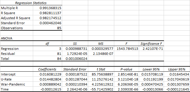
For this initial research, I have applied a simple linear regression model to assess the statistical relationship between unemployment and mortality rates in the U.S. — over a time period extending from 1929 (just at the onset of the Great Depression) to 2017, the years for which data was most readily available from recognized sources. Four data variables are assessed with this statistical testing process:

  • Age adjusted mortality rates (as a % of the population), available for the years 1900-2017 as reported by the National Center for Health Statistics of the U.S. Centers for Disease Control and Prevention (CDC). Note: CDC/NCHS data adjusts death rates after 1998 to the age composition of the U.S. population as of 2000. Death rates prior to this time are taken from historical data.

  • Annual average civilian unemployment rates as reported by the U.S. Bureau of Labor Statistics and reported by the Economic Report of the President (2020), covering the years from 1929-2019.

  • Years with significant (above normal) mortality due to non-employment factors but that address considerations such as wars or pandemics are also included as a third binary variable in the analysis (as will be further described below).

  • Time trend is of particular importance for mortality as rates have experienced a strong downward trend over the last century with the advent and continued positive health results of modern medicine.

The form of the mathematical relationship being tested is:

Mortality Rate = f (Unemployment Rate, War/Pandemic, Time)

But before we get to the statistical testing, let’s take a look at the underlying data.

U.S. UNEMPLOYMENT & MORTALITY EXPERIENCE

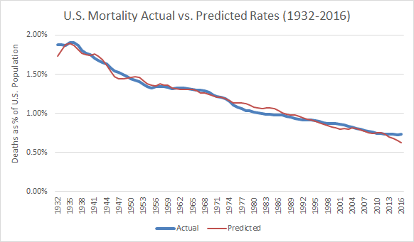
We start the presentation of U.S. unemployment and mortality experience since 1929 with the first in a series of graphs. The red line shows annual deaths in the U.S. as a percentage of total (age-adjusted) U.S. population. The blue bars depict annual average unemployment rates for the same years. Trend lines are also shown for mortality and unemployment (together with the statistical regression equations and statistical fits measured as R-squared).

A-Mortality & Urate Trend.png

At first glance, there appears to be little relationship between unemployment and mortality rates over the last 88 years. In large part, this is because the long-term trend is for rapidly declining mortality due to advances in medicine, public health and other related factors such as improved diets and reduced poverty in the U.S.

Mortality in the U.S. has gone from 2.081% of the U.S. population in 1929 to a low of 0.725% in 2014. As shown by the R-square factor, the linear trend extended through 2017 explains 95% of the variation in year-to-year mortality over this time period.

While there is also some long-term downward trend indicated for unemployment, the greater factor is the still intensely cyclical nature of unemployment in the U.S. — with boom followed by bust — albeit of less severity (so far) than experienced in the Great Depression starting in late 1929. Only 13% of the variation over time in unemployment is explained by the trend line.

While there is a clear and strong overall mortality trend, substantial variations nonetheless appear at the micro level. This is most apparent when the mortality variable is focused on year-to-year changes in death rates — as illustrated by the next chart. The unemployment data remains the same as shown in the prior chart.

B-Change in Mortality vs Urate.png

This graph reveals considerable swings with year to year changes in the mortality rate — which are otherwise obscured by the overall long-term and strong downward secular trend. Note that despite the now more readily apparent fluctuations, most years are associated with a lower death rate than the year before. The biggest upward spikes in mortality occurred during the years of the Great Depression.

Much as when evaluating prices and trading on the stock market, these period-to-period gyrations often obscure more fundamental changes. A way of addressing this issue is to calculate moving averages — applied to both the unemployment and mortality data. In this case, a three-year moving average has been applied. For example, the moving average shown with the year 1932 would be the average of the years 1931-33.

The next graph depicts essentially the same information as with the prior graph, but with application of three-year moving averages to smooth over some of the volatility associated with annual data.

C-3 Yr Moving Averages.png

We are now at a point where it is possible to begin seeing more of the relationship between unemployment rates and annualized changes in U.S. mortality. However, if it is the case that mortality is influenced by unemployment, this effect is not necessarily felt immediately.

This is illustrated by studies such as those of Dr. Brenner which indicate that there is about a 2-year lag between unemployment and the most pronounced changes in heart-related mortality. With strokes and based on European experience, there is a somewhat longer average 3-year delay between the event of unemployment and resulting mortality increase.

In this case, we are concerned with overall mortality associated with a range of morbidity factors. Some will take longer to materialize than others — depending both on the eventual cause of death and the circumstances specific to each individual situation. In this case, after experimenting with several time delay factors, the analysis appears to best support an average 2-year lag from time of unemployment to resulting increased incidence of mortality.

This shift is shown by the following graph. The red mortality line is the same as with the prior graph — as we are measuring mortality as of the year that death occurred. However, the unemployment data is now shifted two years ahead of what was shown on the prior graph. In effect, the unemployment occurs ahead of any subsequent mortality.

D-2 Yr Lag with 3 Yr Moving Averages.png

In this graph, we now begin to see a much closer alignment between the timing of significant changes in unemployment and resulting changes (averaging about 2 years later) in mortality.

So far, we have explored two key factors affecting mortality, first, the long-term trend of reduced death rates over time due to improved medicine and better standards of living. And second, we have addressed the potential shorter-term effects that changing unemployment rates may have on mortality.

So, it is useful to now ask the question: Are there any other factors largely independent of the time trend and unemployment rate that may also potentially have a measurable effect on mortality?

With the European study, Dr. Brenner realized that there was a difference in the mortality profile between northern and southern Europe. Measuring the extent and the validity of this effect involved placement of a “dummy” or binary variable in the equation - a “1” for living in one part of Europe and a “0” for living in the other part of Europe.

With the current analysis, there are two factors that clearly appear to have effects on mortality other than time and unemployment — war and pandemic. In evaluating these two additional factors, it is clear that over the period of 1929 to present, there have been perhaps eight such events worth assessing for their relative significance:

Major War & Pandemics (with 100,000+ fatalities per year of the event):

  • World War II (with significant mortality from 1942-45)

  • Asian Flu (with most U.S. deaths in 1958)

  • Hong Kong Flu (with most U.S. deaths in 1969)

Minor Wars & Conflicts (with far less than 100,000 fatalities per year but yet significant both for combat death and post-war trauma):

  • Korean War (from 1950-53)

  • Vietnam War (with the most active combat from about 1964-73)

  • Gulf War (short lived and with relatively few fatalities in 1990-91)

  • The 9/11 Terror Attack (in 2001 but with potential spread effect)

  • Iraq/Middle East Conflicts (spread over a long time period, most active from about 2003-11)

The following chart is a replay of the prior graph but with these events and their timing also shown.

E - War & Pandemic Overlay.png

As this composite graph shows, there are varied spikes and troughs with the war and pandemic events considered. However, the overall effect on mortality is also being influenced by changing unemployment which has been mixed over the duration of these pandemic events.

This brings us to the regression analysis which is intended to better sort out the relative effects of each variable considered together with its statistical significance.

STATISTICAL REGRESSION ANALYSIS

After considering multiple options, the rough form of the selected regression equation is calculated as:

Mortality = (0.01448 x U-Rate) + (0.00089 x War-Pandemic) - (0.000126 x Time) + 0.01608

where:
Mortality = U.S. age adjusted death rate (as % of total population - calculated as a 3-year moving average)
U-Rate = annual average unemployment rate (expressed as % or decimal - also calculated as a 3-year moving average)
War-Pandemic = dummy or binary figure of “1” for major war/pandemic, “0.5” for minor war/conflict, or “0” otherwise
Time = Year from start of observations, extending from 1932 (Year 1 of observations) to 2016 (85th observation)

Note: Due to the use of a dependent mortality variable significant to five decimal places, coefficients to at least 8-9 decimal places are required as per the ANOVA tables provided at the end of this blog post.

For purposes of this analysis, the unemployment rate (U-Rate) is the primary independent variable of interest. If the unemployment rate increases by 1% (or by .01 in decimal terms), the death rate goes up by a 0.0001448 proportion (or by 0.01448%) of the total U.S. population. This may not seem like much, but when multiplied by 328.2 million U.S. residents (in 2019 as estimated by the U.S. Census Bureau), this equals about 47,500 added deaths for each year of this 1% unemployment increase.

For a few added statistics (as detailed at the end of this blog), the R Square factor for this regression is 0.9828 with the adjusted R Square at 0.9822, meaning that 98% of the variation in annual U.S. mortality rates is explained by the regression equation.

All variables are significant at a 95% confidence level. Based on t-statistics and P-values, the most significant independent coefficient is time — reflecting the strong downward mortality trend over 84 years. The unemployment (U-Rate) variable is also strongly significant at a 11.25 t-value. The War-Pandemic variable is also significant, but less so at a t-value of 4.23.

The relationship between mortality as predicted with this linear regression versus actual mortality experience is depicted by the following graph.

F-Actual vs Predicted Mortality Rates.png

The predicted values generally do well to catch the upsurge in mortality with the Great Depression through World War II and provides its best fit in the period from about 1950-74. From about 1974-93, actual deaths run consistently somewhat below projection with the biggest mismatch in the early to mid-80’s — a time of two recessions but with a relatively large and healthy baby boomer population in prime working years.

The forecast is then relatively on-track with exceptions of somewhat underestimating mortality in the wake of the recession of 2000 and the 9-11 event of 2001. And mortality in the most recent years of 2013-16 has not declined as much as would have been expected with recovery from the Great Recession — which may be in-part due to some flattening out of the long-term mortality trend.

CONCLUDING OBSERVATIONS

While preliminary, the results of this initial analysis are several-fold and sobering:

  • There is a statistically significant relationship between unemployment and mortality in the U.S.

  • There appears to be a time lag of about two years, on average, between the event of unemployment and subsequent associated mortality.

  • Results of this analysis are consistent with other economic and epidemiological studies that have also quantified both a significant and time-lagged relationship between unemployment and subsequent changes in mortality.

  • The one-year increase of 47,500 deaths for a 1% point increase in unemployment associated with this analysis would represent 1.67% of the 2.84 million deaths (from all causes) across the U.S. as of 2018. This is below the 2% mortality increase previously estimated by Dr. Brenner but is consistent with a decline in overall mortality due to improved U.S. health and medical care since the time of his earlier analysis.

  • This 47,500 estimate also corresponds reasonably well with the Bluestone, et al estimate of up to about four decades ago. With 40-45% U.S. population growth over 35-40 years, the Bluestone 37,000 estimate made then would translate to about 51,500-54,000 today based on population growth alone — but then adjusted down for overall declining mortality in the intervening years.

  • The mortality numbers can get much higher, as the annual unemployment rate and/or the duration over which unemployment lasts increases. If annual average unemployment increases by 10% points over a full year through about April of 2021, the nation is at risk of as many as 475,000 unemployment-related deaths. If the unemployment impact were to move into the 20%+ range over a 1-year time frame, the death toll conceivably escalates to nearly the million-person range. The same result ensues if there is an average 10% increase that lasts over two years.

  • The time lag means that the most substantial after-effects on mortality resulting from current rapid increases in unemployment are likely to be experienced about 2-3 years from onset of the pandemic and large scale job layoffs — potentially even after the initial mortality effects of the COVID-19 virus have clearly subsided.

  • The public health perspective nationally and at state/local levels should be adjusted to address not just pandemic deaths but also mortality that reasonably might be expected with increased unemployment — both short- and longer-term. This clearly suggests getting Americans back to work and to stabilized incomes sooner rather than later. And it also depends on a much more balanced approach in planning for and executing responses to future pandemic or other emergency situations of national or global proportion in the years ahead.

SUPPLEMENTAL NOTES: ANOVA DETAIL

Summary output or analysis of variance (ANOVA) detail for the selected regression equation as calculated with Microsoft Excel is provided by the following table.

F-Actual vs Predicted Mortality Rates.png

Several added technical notes are made regarding the analysis conducted to date:

  • In assessing an appropriate time lag for mortality, separate regressions were run for the mortality-unemployment-war/pandemic datasets with time lags of 1, 2, 3, and 4 year periods. The 2-year lag performed best in terms of R squared, t-value and F-statistic outputs. The 3-year lag was next best, then the 1-year and 4-year regression runs.

  • With the binary/dummy variable, consideration was given to a single variable (with 0.0, 0.5 and 1.0 values for no issue, minor war/conflict and major war/pandemic, respectively) versus a two-variable approach. The two-variable approach involved separate dummy variables — one for major war/conflict periods and a second for minor war/conflict years. The two-variable approach yielded a slightly lower R-square coefficient and also lower t-values than experienced with a single binary variable. Of considerable importance was the observation that the coefficient for the minor war/conflict variable was 49% of that for the major war/pandemic variable, which supported the 1.00/0.50 application with the single binary variable as the preferred model.

  • This analysis was limited to a 1929 and later time period as the most readily available unemployment information starts at 1929, while NCHS age-adjusted mortality data is available back to 1900. Currently out-of-print information from the National Bureau of Economic Research (NBER) is available from 1900-54, but with some data mismatches in the overlapping time periods.

  • As noted, the mortality data is age-normalized rather than reflecting the actual year-to-year mortality for populations for the dataset sampled. Future refinements might also include non-revised rather than NCHS age-normalized mortality for purpose of comparison and explanatory utility.

  • As discussed by analyses such as Brenner’s work for the European Union, there are other potentially inclusive indicators of economic health than sole reliance on unemployment statistics. More encompassing indicators might include gross domestic product (GDP), various measures of income inequality, and measures of socio-economic status (SES).
    There are two problems with this approach. First, is that there can be substantial disagreement on what these more encompassing indicators should comprise. Second and perhaps of more importance for this analysis, while these SES-type indicators might be more all-encompassing, they tend to lag behind unemployment. Despite its limitations, unemployment data represent, in effect, the proverbial “canary in the coal mine” — providing the most advanced warning of what may be to come.

Additional information in response to inquiries is available on request. This blog is subject to minor edits subsequent to initial posting on May 9, 2020. For regularly updated information regarding U.S. COVID case-mortality, employment and economic recovery to date from the pandemic, click here on Economy Watch.

Update Notes (As of February 23, 2023)

Since formulating the forecast model early on in the pandemic, it has been this author’s objective to review actual outcomes with comparisons as may be possible to the forecast model. This has proved challenging for three primary reasons:

  • COVID has unfolded, then receded and re-emerged in several waves to date — with mid-pandemic assessments challenged, especially as mortality associated with unemployment increases occurs well after the fact (estimated at about 2 years). This necessitates a considerable wait (till about now) to begin conducting a retrospective review.

  • The forecast model applied (as described above) also uses a 3-year moving average to smooth the data, removing excess data “noise” that could render interpretation of the results more challenging. The combination of a 2-year lag between unemployment and mortality coupled with a three year moving average means that some of the data for out-years of the pandemic (as for 2022) is not yet available. NCHS-CDC compiled mortality data is currently available only through the 2nd quarter of 2022. The 3-year moving average for mortality means that results for the near tail end of the pandemic (assuming it is 2022) requires mortality data extending through 2023 which is now just underway.

  • Finally, the rapid intervention of the Federal Reserve and congressionally approved stimulus meant that, while unemployment briefly spiked to nearly 15%, jobless rates were then subsequently rapidly reduced — more so than occurred with other major economic disruptions which did not include such massive stimulus. In effect, there may be economic hardship (including business closures, start/stop cycles with various lockdown measures, and related economic stresses) beyond what is fully captured by unemployment rates alone.

With these admittedly significant caveats in mind, it is nonetheless useful to review what can be discerned from COVID and unemployment experience to date. As of mid-February 2023, NCHS-CDC data indicates that there have been an estimated 1.3 million excess deaths in the U.S. since February 2020. Of this number, 320,000 (25%) of the deaths over this approximately 3-year time frame are labelled as “excess deaths — all causes excluding COVID-19”.

Using data that is available and interpolating for information not yet available, the forecast model as formulated and applied indicates that between about 225,000-300,000 deaths across the U.S. may be associated with both direct and indirect consequences of unemployment and related stresses to date. The range is based on how data points not yet available are interpolated based on information that is available to date.

Even with uncertainties of methodology and data for both CDC estimates and modeling with this analysis, initial evidence suggests that a majority (perhaps 70 to 90+ percent) of the non-COVID excess deaths since start of the pandemic may be associated with unemployment and related economic stresses through the pandemic.

An objective of this author is to update this forecast model and retrospective analysis once a more complete dataset is available — most likely at some point in the 2024-25 time period. Going forward, any value with this initial modeling exercise as occasioned by The Big Short may be subject to review and refinement in the years ahead. A more sophisticated, science-based and appropriately nuance approach ideally should enable practitioners and policy makers to better understand the linkages between major health crises and economic dislocation — for improved policy choices should events of this type and magnitude recur in the future.

Initially Copyrighted © May 9, 2020 by E. D. Hovee & Company, LLC
To receive my periodic blog posts, simply e-mail me at ehovee@edhovee.com and say “Subscribe”

WHAT PRICE CORONAVIRUS?

Note: This article has been updated from the initial post (as of April 22, 2020).

Nearly 2,000 years ago, a sage spiritual leader asked those who would take on any project of consequence to "first sit down and figure the cost so you'll know if you can complete it." Just to make sure that no one misunderstood the range of costs to be considered, this founder of what became the Christian movement offered up two illustrations : the cost of a physical construction project (building a tower), and the cost of going to war (assessing the capabilities of one's army against that of the enemy).

So, in our current pandemic, count not only the costs of those who will be directly stricken by an unseen enemy, but also those who will be affected by potential loss of livelihood and home. In 2020, the U.S. and much of the rest of the world have gone into virtual lockdown in a mad rush to avert or mitigate the mortality effects of COVID-19 virus — albeit with minimal consideration of the short and long-term cost necessary to beat this previously unknown foe.

As David Farragut, flag officer of the U.S. Navy declared in a battle of the American Civil War: "Damn the torpedoes, full speed ahead."

In 244 years of the American republic, there has never been an occasion when the U.S. and most states effectively shut down the social and economic life of the country. Not even in wartime have such radical steps been taken.

Yes, there's lip service given to mitigating the collateral damage, but no meaningful initiative to date to directly and honestly answer the threshold question: Is the cure worse than the disease? Is the price we are paying to combat this pandemic too high?

Or perhaps the question is better phrased as: What price is too high? 

COMPARING THE COST

For some perspective on the human toll of the virus, it is useful to make comparisons with other conditions affecting mortality in the U.S.

Consider this. As shown by the following graph, there were over 2.8 million deaths in the U.S. for calendar year 2018. By comparison, as of April 16, 2020, COVID-19 has claimed close to 31,000 American lives. The number of deaths attributable to coronavirus, to date, equates to about 1.4% of total annual mortality in the U.S.


New York Times figures do not include more than 4,800 people in New York City who died and are believed to have had the coronavirus. As reported by the Times, many of those patients died without being tested, a consequence of a strained medical syst…

New York Times figures do not include more than 4,800 people in New York City who died and are believed to have had the coronavirus. As reported by the Times, many of those patients died without being tested, a consequence of a strained medical system and a persistent lack of testing capacity.

As depicted by the graph, a few other selected indicators are of note. The number of people in the U.S. who have died of COVID-19 to date can be calculated as equivalent to:

  • Approximately 5% of the number deaths of all persons age 85 and over who passed away in 2018 (for any and all reasons)

  • 6% of the number of deaths for those age 75-84

  • 6% of the number deaths of those who die of heart disease each year
    (the number 1 killer in the U.S.)

  • 7% of the number of deaths attributable to cancer

  • 24% of the number of deaths caused by accidents of all types
    (Just over 100% of the number of deaths attributable to vehicle accidents)

  • 47% of the number of deaths attributable to diabetes

  • 68% of the number of deaths attributable to flu & pneumonia

  • 78% of the number of deaths attributable to kidney disease

  • 83% of the number of deaths attributable to suicide

While lost jobs are not a form of physical mortality, they do represent human and economic loss. As of April 11, the increased joblessness of more than 22 million means that well over 500 jobs have been lost for every coronavirus death, to date. And like COVID-19 deaths, the number of unemployed has yet further to go on its upward trajectory.

Bottom line and while tragic, the number of deaths attributable to COVID-19 is only a small fraction of all mortality — only a small fraction of deaths attributable to the major causes of death in the U.S. Why this undue focus on an unseen killer which has, so far, added only marginally to the on-going death toll associated with the everyday cycle of life and death across America?

Would we lock America down like this to go all out to stamp out the causes of diabetes or cancer? What about to eliminate all car accidents by shutting down all motor vehicle transportation? Or to prevent all suicides?

What is it about COVID-19 that gives the fight to take on this pandemic a higher priority than addressing any other substantial form of mortality? Is this a battle worth impoverishing large segments of the American population for years to come?

As of mid-April, the chief economist of the International Monetary Fund (IMF) has stated that:

As countries implement necessary quarantines and social distancing practices to contain the pandemic, the world has been put in a Great Lockdown. The magnitude and speed of collapse in activity that has followed in unlike anything experienced in our lifetimes.

Do we care about the cost to America? Do we care about what the IMF now says will be the worst downturn since the Great Depression of nearly a century ago? Or is our answer to be that of the medical bureaucrats who, like Farragut, would command: "Damn the torpedoes, full speed ahead."

Damn the cost, damn the livelihoods lost. Damn the kids whose educations are disrupted. Damn the increased disparity between the haves and have nots. Damn the loss to public revenues essential to provide public services. Damn the death of small businesses and gig workers into the hands of an engorged  corporate America. Damn the deplorables to strengthen the self-proclaimed rule of the medical-bureaucratic elites.

When will anyone have the guts to answer these questions?

REJOINDERS

There are those who would undoubtedly say this is over-the-top hyperbole. Even if there has never been an explicit policy pronouncement that this fight is worth any cost, there seems to be some implied social contract to make this effort, no matter what price it takes.

And there are technical issues, like:

  • This is a disease of unknown proportions unlike other diseases for which risk can be more readily measured and calibrated — so it's worth going all out to beat the unknown (unlike such known maladies as cancer, diabetes, car accidents or suicides for which risks are now well defined).

  • What we do know is that the more than 40,000 deaths (as of April 21) will grow larger by the time this is over — maybe now to 100,000 or 200,000 or if we relax too much off measures like social distancing, conceivably increasing to less likely worst case scenarios of perhaps 1 - 2 million.

  • And there may be recurrences, flare-ups in the infection rate, as a start-stop stutter process that continues indefinitely — at least until a vaccine is found.

There are counters to these likely responses. No choice of this magnitude should occur merely as part of some implied social construct. If cost be damned is to be the order of the day, that should occur via informed and explicit legislative actions at federal, state and local levels including a policy commitment to hold the rest of society harmless, not impoverished — no matter what it takes, whether short or long term.

And regarding the technical issues. While this is a disease with many unanswered questions, the unknowables have been pared back as the health care community learns more day-by-day. We certainly know that the major variables to managing the risks going forward involve slow and measured ease-off of social distancing, widespread testing for the virus and for antibodies, getting therapeutic drugs and vaccines quickly to market (to reduce and ultimately stop the ravages of this disease), and (quite possibly) contact tracing using the tracking powers of ubiquitous smart phones.

In instances where the private market is not responding quickly enough — whether with masks or testing equipment — the powers of the presidency could be more actively applied to compel production and distribution. Now, not later.

We even have learned enough from disease modeling to better understand the potential range of outcomes and how the key variables likely influence these outcomes. And the monitoring tools related both to COVID-19 and economic recovery are there to gauge what is happening in real time — then scale the regulatory mechanisms to ease-off or tighten accordingly.

But there's one step that is essential to make all this work. There needs to be some general and explicitly communicated consensus of what a reasonable mortality target should be. It's not good enough to say that we aim to bring the rate down as much as possible. That approach suggests that our resources are infinite and that the cost imposed to get that one extra life saved is worth the universe.

Rather, aim for realistic targets. Based on what is known today, it now appears reasonable to aim for a goal of less than 100,000 deaths before this is over - but accept the possibility of going as high as 200,000 (as within the range of variability). Note: Even if there were 200,000 COVID-19 deaths this year, annual deaths in the U.S. would increase by only about 7% — going from an underlying rate of about 2.8 - 2.9 million per year to perhaps 3.0 - 3.1 million.

Coronavirus mortality targets should ideally exclude estimates of co-morbidity where an elderly or immune-compromised individual is likely to experience near term death anyway, with or without the virus. The medical profession needs to come clean and quantify the extent to which co-morbidity is or is not occurring.

WHICH WAY FORWARD?

Maybe it’s time to pay a bit more attention to sage advice — historically proven. Count the cost before going into battle. Do it before continuing to spend extraordinary sums of funds while impairing business and household incomes with minimal regard to both foreseen and potentially unforeseen consequences. Not just the cost from one perspective, but from all relevant viewpoints before making decisions as to the most viable course of action.

Putting this in today's context, this could mean continuing to follow the course of continued lockdown if the cost to the rest of humanity is widely viewed as worthwhile to save a small percentage of deaths, including at least some who are likely to die anyway. Alternatively, tack toward a new course of COVID-19, social and economic recovery if this is the more acceptable price.

Either way, make the choice consciously and with the consent of the governed. The worst of all worlds will be to attempt to muddle through — putting the cart ahead of the horse. The interests of the self-anointed over those doing the work — on whom the future of our republic ultimately rests.

THE CHANGING LINK BETWEEN COVID-19 & JOBLESSNESS

What a difference a week makes! And not for the better.

In one week from March 29 - April 4, the U.S. coronavirus mortality rate quadrupled from a cumulative total of 7 to 28 deaths per million U.S. residents. The number of new unemployment claimants has gone from over 10 million to nearly 17 million jobless. Claimants in the last three weeks now equate to about 10.4% of the normalized base of 145+ million U.S. workers covered by unemployment insurance.

This blog post updates statistical information posted on April 4 regarding the state-by-state relationship between COVID-19 and joblessness. And this week, our update also looks at the breathtaking changes in both metrics as have occurred in just one week’s time.

Note: For this review, information is as of an April 4 weekly report (the latest for unemployment claims). In contrast, COVID-19 death data is posted daily. As of April 11, the nationwide COVID-19 mortality rate had jumped from 28 deaths per million population (on April 4) to over 65 deaths (April 11), led by dramatic increases in New York mortality (as shown by the map on our website home page). This linkage review will be updated for April 11 jobless data when this updated employment data is next made available Thursday, April 16.

EARLY APRIL UPDATE

The following graph compares cumulative unemployment claims filed during the weeks ending March 21, March 28 and April 4 with COVID-19 mortality as of April 4.

As with last week’s chart, cumulative unemployment claims over a 3-week period are calculated as a % of total covered employment, by state. Mortality is calculated in terms of the number of COVID-19 related deaths per million residents, by state.

Deaths vs Layoffs 4-4-20.png

If you were to compare this week’s scatterplot with that of last week, the most obvious change is that the variability of outcomes has greatly widened. As of March 29, New York’s cumulative mortality rate was 50 coronavirus deaths per million residents. One week later, the mortality rate had more than quadrupled — to about 214 deaths per million population as of April 4 (a number that has again more than doubled to 482 deaths per million as of April 11).

And the span of joblessness has widened. As of March 28, Pennsylvania and Rhode Island had experienced unemployment claims equaling 13.8% of total base employment. As of April 4, Rhode Island’s rate has jumped to 19.4%.

Several other items are of note in with this update:

  • There is much greater spread of mortality rates than before. In addition to New York, the states of New Jersey and Louisiana have mortality rates at just over 100 deaths per million residents. Michigan now tops 50. All other states and territories have mortality rates of less than 50 deaths per million.

  • There is also a much wider range of unemployment claims — from 4% to nearly 20% of the total workforce covered by unemployment insurance. At the upper end of the spectrum are Rhode Island, Michigan, Pennsylvania, Nevada and Hawaii, all in the 16-20% range. The lowest rate is noted for South Dakota at 4%. Despite having almost off the chart mortality, New York’s 8.4% rate of unemployment claims is below the nationwide 3-week cumulative rate of 10.4%.

  • And there is now a circled group of about 25 states (with Washington D.C. included) that so far have experienced a combination of relatively low mortality (below 45 deaths per million population) and low rates of unemployment claims (below 10%). This group includes some very rural as well as urban states - with strong representation from the sunbelt and mid-America. These are the states that, so far, might be considered as either best practice examples or just plain lucky as compared to the other half of states.

Focusing more on what is working well for half the states may help in determining a path out for further curve flattening and for economic recovery. But before jumping too quickly to conclusions, we shift the analysis to also consider changes of the last week - both in mortality and joblessness.

CHANGES IN COVID-19 DEATHS VS JOB LAYOFFS

An added feature of this update involves comparing outcomes of the period ending March 28 with April 4, one week later. The following graph displays much of the same information as the prior illustrative depicting trends in coronavirus morality versus job layoffs. The difference is that the prior graph showed the pattern of deaths versus layoffs as of a single point in time (April 4) — while the following graph shows the change from one week to the next (from March 28/29 - April 4).

Change in Deaths vs Layoffs 3-28 - 4-4-20).png

As shown by the graph:

  • Just 8 states experienced an increase of COVID-19 mortality of at least 20 deaths per million residents in the most recent week ending April 4. Led by New York (with a week-over-week increase of nearly 165 deaths per million, other places with mortality increases of 20 or more per million residents were New Jersey, Louisiana, Michigan, Connecticut, the District of Columbia, Massachusetts and Rhode Island. The increase in mortality rates nationwide averaged 21 deaths per million residents.

  • All the remaining states experienced mortality rate increases of 20 added deaths per million residents or less. The extent to which these slower rates of increased mortality is due to good public policy, lower population density, and/or just plain luck varies widely across these states.

  • There also is wide disparity in the job layoff patterns across these states with slower growth in mortality rates. Georgia’s unemployment claims increased by 9% of the employed work force in the one week ended April 4. At the other end of the spectrum, Colorado’s unemployment claims increased by less than 2% points. In effect, there appears to be no guaranteed employment reward for those states that have contained the death toll, to date.

A PATH TO ECONOMIC RECOVERY?

At long last, serious discussion about re-starting the American economy is beginning to get underway. At this point, there is as yet no certainty as to the appropriate mechanisms or timeline for Americans going back to work. This is likely to be a subject of intense debate from health care and economic perspectives, not to mention anticipated differences across the political spectrum

Are there any observations from this coronavirus and joblessness discussion worth considering as part of this emerging policy debate? Three observations are suggested:

  • First, as has been previously suggested, this updated review further reinforces the observation that national and state-level policy should not be framed around the assumption that “one size fits all.” New York’s experience (together with that of adjoining states) is well beyond the pale of what has been or is likely to be experienced across much of the rest of the country. This is made abundantly clear by the very different curve flattening trajectory that the nation’s most populous state — California — has followed. And the experience of a California is yet different from that of a Wyoming or South Dakota — where mortality rates increased at 0 and 1 deaths per million residents over this most recent week.

  • Second, this analysis does suggest that continuous monitoring of changing mortality may serve as a useful guidepost for determining which states are best positioned to ease away form their business shutdowns — and how quickly. States like New York, New Jersey, Louisiana, and Michigan appear to warrant continued lockdown until the mortality growth rates ease back to the national average (or to below zero). Other places like DC, Connecticut and Pennsylvania that have been relatively calm so far may be erupting as data over the next one to two weeks may demonstrate — warranting more intensive measures at least temporarily.

    Conversely, states that have consistently held mortality increases to well below the national average gain of 21 deaths per million this last week (to a gain of, say, no more than 10 deaths per added million), appear to be the best candidates right now for potential relaxation of shutdown requirements. Of 52 states and territories, 36 appear to be in this category right now. Of these, 20 are below a mortality gain of 5 per million for the week ended April 4.

    As the country reaches the peak of mortality in the days or weeks ahead, the weekly change in national COViD-19 should go to zero and then negative. As the weekly mortality threshold for America declines, states remaining below the national curve offer the best case to be the most quickly rewarded with economic re-boot. This type of monitoring and economic adjustment may be required not only in the weeks ahead but over an extended period to limit the risk of re-infections longer term.

  • Third, a similar but more nuanced approach might be taken to states experiencing unemployment claims well above the national average. To what extent are higher rates due to earlier shutdowns, different industry mix (as with a high proportion of businesses dependent on face-to-face contact), unusually draconian business closure requirements, or other factors? Encourage states with unduly high rates but without demonstrable mortality benefit to begin opening sectors posing the least risks of virus transmission.

ANY LINK BETWEEN COVID19 & JOBLESSNESS?

As follow-up to a blog of April 2 on The Jobless Trajectory: State-by-State, E. D. Hovee has done further analysis to compare recent job layoffs with coronavirus related mortality — on a state-level basis. The following graphic is a plot comparing cumulative jobless claims filed during the weeks ending March 14, 21 and 28 with COVID-19 mortality as of March 29.

In the chart, cumulative unemployment claims filed over this three week period are calculated as a % of total covered employment, by state. Mortality is calculated in terms of deaths per million residents, by state.

COVID vs Job Layoffs.png

At first glance, there would appear to be little evidence of any clear statistical relationship between coronavirus deaths and job layoff experience, by state. Even if there were to be a clear statistical relationship, no direct causality is asserted at this point. In other words, no assertion that high mortality necessarily causes a state to exact massive job shutdowns, and no assertion that job shutdowns affect mortality one way or the other.

However, there may yet be a story to tell. As suggested by the graph, four potential clusters of activity are noted:

  • First is the experience of the 6 high mortality states — New York, Louisiana, Washington, Vermont, New Jersey and Michigan — with mortality to date ranging between 10-50 deaths per million residents. While each has a slightly different story to tell, all but Vermont are states with relatively high population densities. Vermont is a low population state but in the outer orbit of the Boston and New York spheres of influence — as is obviously the case for New Jersey. Washington state got it early on (clustered in one facility) and Louisiana suffered in the aftermath of Mardi Gras. Michigan is in the early stage of a significant increase in virus cases in the Detroit area. And New York is both highly dense and internationally focused, both of which put the city and metro area at greater risk.

  • Second is the experience to date of three states experiencing high job loss of more than 12 to nearly 14% — Pennsylvania, Rhode Island, Nevada — albeit with minimal coronavirus mortality experience to date. One could argue that these states are bearing an unnecessarily high economic burden relative to virus-posed risk, so far.

  • Third is South Dakota clustered with 10 other states that have experienced less than 4% job loss and less than 10 deaths per million population. Several of these states, in addition to South Dakota — Arkansas, Colorado, Mississippi, Utah, West Virginia and Wyoming — have below average population densities. Four states — Connecticut, Florida, Georgia and Texas — are more densely populated but with the southeastern states politically resistant to early job shutdown.

  • Finally, there are another 30 states that have experienced job losses ranging from 4% to less than 10% but also with relatively low mortality rates. These are critical swing states that may be experiencing somewhat disproportionate job loss relative to reduced mortality — but perhaps investing now in shutdown to better stave off potentially harder pandemic-related times to come.

Currently, there is considerable debate as to whether more stringent national guidelines should be extended (or mandated) across all 50 states uniformly. The alternative is to continue providing state-by-state discretion to adapt to changing conditions when and if warranted.

This analysis, while preliminary, suggests that when it comes down to determining the right tradeoff between human and economic survival, the right choice is not necessarily “one size fits all.” Neither the circumstances nor the policy prescriptions appropriate for New York are necessarily well suited for South Dakota or Wyoming.

In the weeks (and perhaps months) ahead, the death toll will inevitably increase. So will the loss of gainful employment and business opportunity — some quickly recoverable and some not. The pivotal and ever more painful decision will be how to make the trade-off between potential lives lost versus impoverishment for many of the more numerous survivors. .

If there is to be a national mandate, let it be a prescription that sets certain threshold targets, which when violated, will become mandatory at the state level. Otherwise, let state-by-state discretion prevail. And let both the national and state-local level decisions be guided by both real-time heath and economic data — each in tension and balance against the other.

THE JOBLESS TRAJECTORY: STATE-BY-STATE

As of this morning (Thursday, April 2), the U.S. Department of Labor has released the latest week’s unemployment insurance claims. In the week ending March 28, more than 6.6 million Americans filed new initial unemployment claims. This more than doubled the 3.3 million claims filed last week - which itself was briefly the largest single week of jobless claims in U.S. history.

This most recent week’s claims far surpassed economists projections of what the continuing (or escalating) economic damage would be. As the Wall Street Journal went to press late April 1, it was citing a survey of economists who predicted about 3.1 million filed claims — about the same as the week before. The actual result was more than twice the prediction.

The blog begins with a look at national unemployment filings — followed by a state-by-state overview.

National Experience Summarized

Up until the week of March 21, the U.S. had been experiencing an average of just about 250,000 initial unemployment filings per week. As illustrated by the following graph, if one adds the seasonally adjusted figure of 282,000 for the week of March 14 to the 3.3 million filed on March 21 to the 6.6+ million of March 28, the cumulative total claims filed over the last three weeks is about 10.2 million (as a seasonally adjusted figure).

U.S. Weekly Claims (3-28-20).png

If considered in terms of data that is not seasonally adjusted, the cumulative 3-week claims figure is 9.0 million - as the winter is usually a period of slower economic activity than other times of the year.

This last three-week experience accounts 7.0% of the nation’s 145 million workers covered by unemployment insurance (on a seasonally adjusted basis), or a somewhat lower figure of 6.2% (in raw unadjusted terms). Prior to mid-March, typical weekly filings accounted for less than 0.2% of the nation’s covered job base.

Note: Weekly claims data are not the same as the nation’s unemployment rate — which stood at 3.5% as of February 2020, increased to 4.4% as of March. This is based on survey data which includes unemployed not covered by insurance, as of about March 12 (just before significant layoffs got underway). Due to timing of the survey process, monthly reports likely will understate the actual rate of real-time unemployment over the period that layoffs continue.

STATE-BY-STATE REVIEW

State-level data is summarized on a basis similar to that of the national data — albeit with two caveats:

  • State-wide data is only available on a basis that is not seasonally adjusted; and

  • Instead of providing raw numbers of unemployment claim, the analysis normalizes the data across large and small states by discussing unemployment claims as a percentage of each state’s covered employment base.

So, let’s take a look. The following graph shows the experience of each of the 50 states plus territories over the weekly unemployment claim periods ending March 14, 21 and 28. Total claims as a % of the state’s total employment base are depicted in rank order, from the most to least impacted.

Unemployment Claims by State.png

On initial review, a few items are noted about this rank ordering:

  • Pennsylvania and Rhode Island appear to the be most impacted states with unemployment filings through March 28 — with 3-week filings at 13.8% of their respective states’ employment base.

  • The top 5 most impacted are rounded out by Nevada, Michigan, and Washington — each at about 10+%. This top five grouping includes three industrial states plus Washington affected early with the virus outbreak and Stay Home requirements, and Nevada which is heavily reliant on tourism.

  • In total, 23 states are more impacted than the national average of 6.2%. This is an interesting mix of states — with representation from both coasts plus some states (such as Michigan, Ohio, Kentucky and Indiana) from the industrial heartland.

  • Somewhat surprisingly, California, Illinois and New York rank near the middle in terms of layoffs to date. While intensely urban in parts, other significant portions of these states consist of smaller communities that may not yet be as impacted by COVID-19 and associated business curtailment.

  • Least impacted to date are the Virgin Islands with only 1% of jobs affected — followed by South Dakota. The lesser impacted states appear to be more rural and/or slower to put in place state-wide social distancing, shelter-in-place, business closure, or other lockdown requirements.

All-in-all, this listing indicates a disparate range of employment displacement experience (with anywhere from 1% to 14% of statewide employment affected through March). A logical question is whether this diversity of experience warrants different, custom-made policy and regulatory initiatives, rather than “one size fits all.” The counter-argument is that states with minimal impact are likely to catch up, leveling the playing field, as virus impacts inevitably widen and/or national policy transitions from guidance to mandates.

Look for more to come - with a deeper dive into the linkage between job displacement and COVID-19 experience.

CORONAVIRUS: COMPUTING THE DEATH TOLL

On March 13, the New York Times reported that the U.S. Centers for Disease Control and Prevention (CDC) had prepared four scenarios of the potential medical impact of COVID-19 (details of which have not been fully published), indicating that anywhere between 200,000 to 1.7 million U.S. residents could die over the duration of the pandemic. And this could involve hospitalization of anywhere from 2.4 million to 21 million people. The hospitalization scenario is particularity concerning to CDC and the public considering that the U.S. only has a little more than 924,000 staffed beds.

What has been released by the CDC for publication are age-specific hospitalization, intensive care (ICU) and mortality rates of the U.S. population based on experience from February 12 to March 16 of this year. While this initial sample is relatively small (at 2,449 cases), it begins to provide a window into potential case-fatality, estimated to range between 1.8% to 3.4% of all persons infected.

The combination of these two studies make it possible to assess potential mortality scenarios relative to more normalized patterns of age-specific deaths in the U.S. That is the purpose of this blog.

We walk through this analysis in several steps:

  • First, considering age-specific mortality for the U.S. in a typical year — in this case 2018 as the most recent year with data available from the National Center for Health Statistics (NCHS).

  • Second, looking at what is publicly known, so far, about the CDC scenarios of potential U.S. deaths from the pandemic.

  • Third, combining the CDC scenarios with recent case-fatality data as generated by the CDC to estimate the percentage distribution of deaths by age.

  • Fourth, bringing all of these datasets together to compare how COVID-19 mortality projections compare to underlying existing (or normalized) death rates for the U.S.

As will be evident with the data presented, there is still a considerable range of estimates for many of the variables discussed. With more case experience, it hopefully will also become possible to refine and tighten the range of estimate.

Consequently, this blog may be updated to reflect new information as it becomes available. Questions and comments about the methodology used with this somewhat simplified but potentially informative review are also appreciated.

Age-Specific Mortality

This discussion begins with a review of age-specific mortality rates for the U.S. population (age 15+) as of 2018. As illustrated by the following chart, the annual death rate per 100,000 population ranges from just over 70 deaths per 100,000 persons age 15-24 to about 13,450 per 100,000 who are age 85 and over.

Age-Specific Mortality (2018 Table).png

This data serves as a baseline as to the normalized pattern of mortality - independent of effects of a major pandemic such as coronavirus.

CDC Mortality Scenarios

As noted, the New York Times on March 13 headlined an article as: “Worst-Case Estimates for U.S. Coronavirus Deaths.” While details do not appear to have been publicly released of this CDC-sponsored teleconference with 50 experts from around the world, the Times reports that it obtained screenshots of the CDC presentation from someone not involved in the meetings. The newspaper then verified the data with scientists who did participate.

The discussion was aimed to address the question of how many people might be infected, need hospitalization, and/or die as the virus takeshold in the U.S. As reported by the Times:

One of the agency’s top disease modelers, Matthew Biggerstaff, presented the group on the phone call with four possible scenarios — A, B, C and D — based on characteristics of the virus, including estimates of how transmissible it is and the severity of the illness it can cause. The assumptions, reviewed by The New York Times, were shared with about 50 expert teams to model how the virus could tear through the population — and what might stop it.

While details were not provided for all four scenarios, the March 13 article brackets the range of scenarios with low and high estimates for an epidemic lasting for months or even over a year:

  • The low estimate indicates that 160 million could be infected with 200,000 deaths.

  • The high estimate involves up to 214 million U.S. residents infected with as many as 1.7 million deaths (essentially with a much higher mortality rate for those infested).

It would be useful to have more detail regarding all four scenarios and the assumptions that stand behind each alternative projection. However, even with these summary numbers, it is possible, on a preliminary basis, to model the age-specific implications of these low-to-high mortality estimates.

CDC Age-Specific Case-Fatality Analysis

Subsequent to CDC’s base mortality scenarios, the agency has released age-specific hospital, ICU admission and case-fatality information — covering U.S. cases over the period of February 12 to March 16. As detailed by the following chart, the resulting database comprises 2,449 cases, disaggregated by age group and providing range estimates for each of these three indicators of medical need and result:

  • The lower bound of the range is estimated by CDC using all cases within each age group as denominators to calculating each incidence rate.

  • The upper bound is estimated by using only cases with known information on each outcome as denominators.

CDC Case-Fatality Rates for COVID-19.png

The columns under the blue banners are directly from the CDC data base. The last three columns under the red banner involve supplemental calculations by E. D. Hovee:

  • The first red column rate by age reflects the mid-point between the low and high estimates by CDC.

  • The second column provides an imputed estimate of deaths in the CDC data base (not directly stated by CDC but calculated from the case rates divided by the mid-range case-fatality rate).

  • The third column provides a distribution of the number of age-specific deaths as a percent of the total (and is applied with the next and final step to the analysis which now follows).

U.S Deaths by Age & Coronavirus Scenario

This final step combines the baseline historical mortality data with the death rate scenarios as consistent with the CDC datasets. The following table provides a summary of the results of these calculations:

  • The first column provides the age group categories by which the data has been compiled - with the 0-14 age group excluded because it is not shown as part of the NCHS dataset and because no fatalities are indicated with the CDC coronavirus dataset as available, to date.

  • The second column shows the number of deaths as of 2018 from the NCHS dataset as the baseline expectation of mortality that might be expected in the absence of COVID-19.

  • The third column adds in the low estimate of coronavirus deaths totaling the control total of 200,000 deaths, assuming that there is no overlap of coronavirus deaths with baseline mortality (a topic described further below).

  • The fourth column adds in the added increment of high estimate coronavirus deaths, assuming a hypothetical 50% overlap between baseline mortality and coronavirus deaths (also described below).

  • The fifth column indicates the cumulative total of existing baseline + low estimate + high estimate added coronavirus related deaths.

  • The final column calculates the ratio of cumulative deaths divided by existing baseline mortality.

EDH Mortality by Age & CDC Scenario.png

As indicated by the above chart, the high estimate scenario is associated with an overall mortality rate for persons 15+ that is 130% of (or 30% greater than) the baseline of existing 2018 U.S. deaths:

  • For persons age 15-14, the high estimate of death is only 7% greater than existing baseline conditions.

  • Conversely, the mortality rate is 36% greater for those those over age 35 than with baseline conditons.

  • Generally speaking and consistent with press reports, the mortality rate effect of COVID-19 increases for older age cohorts than younger. The exception is at the 75-84 year age bracket, perhaps a statistical anomaly due to the as-yet relatively small sample size of the CDC database.

These comparisons can also be made in graphic terms, as illustrated by the following graph.

Graph - Deaths by Age & Coronavirus Scenarios.png

With the low scenario, the addition to existing death rates is much smaller — adding only 1.6% to the death rate for 14-44 year olds and 8.5% to morality for 85+ year old seniors. Over all 15+ age groups, mortality increases by just over 7%.

A critical (and not yet known) variable included with these hypothetical scenarios is the degree of overlap between existing deaths (that would happen anyway) versus deaths that might be attributable solely to COVID-19. In between is a middle category of deaths that might have happened this year without coronavirus but for which the virus was another contributing factor. In some cases, coronavirus would accelerate the time of death, in others it might be a minor factor due to the seriousness of other underlying conditions.

No data has been made available from CDC that provides guidance as to how this may be attribution can best be made. And to a large extent, this may be an unknowable, for example, trying to ascertain to what extent alcoholism or heart disease or diabetes may have each contributed to a person’s demise.

As noted above, for sake of illustration and discussion, this analysis hypothesizes:

  • No overlap with the low coronavirus estimate - assuming that coronavirus is the primary death factor due to its relatively low incidence relative to baseline mortality.

  • 50% overlap with the high coronavirus estimate - assuming that a higher rate of infection and serious complication will inevitably involve a higher proportion of people with existing underlying issues.

If the 50% overlap estimate is off the mark so that there is little or no overlap with the high coronavirus death estimate, then we would be faced with a worst-worst scenario. In effect this could increase the total annual U.S. death toll from 3.7 million per year with coronavirus to as many as 4.5 million. This means that instead of COVID-19 accounting for a death rate increase of 30%, the increase in death rate would increase by 60%. and for persons 85+, the death rate attributable to coronavirus could increase by as much as 72% rather than 36%.

Conversely, it may be that the overlap is even greater than 50%. This possibility is supported by the observation from cases to date that most fatalities have involved individuals with existing (generally multiple) underlying health issues.

In effect, it may be the COVID-19 is not the sole cause of death but a contributing factor — in some cases the final tipping point, in others perhaps not. A more granular examination of mortality data might be useful to attempt to quantify how much a person’s life span, on average, is shortened as a result of this virus. Shortening a life by 1 month is much different than reducing the life span of a senior citizen by, say, five years. The appropriate policy choices may also differ substantially based on this type of determination.

IMPLICATIONS

The question of how much America’s coronavirus will increase deaths will have an obvious influence on the inherently no-win task of determining the appropriate trade-off between saving lives and salvaging the country’s economic and social well-being.

This blog intentionally avoids the question of what set of policies best provide the best balance of countering or mitigating two pressing and conflicting catastrophes. Rather, the implications of most immediate interest involve improvements to the base data so that the decisions made will be more informed. From a data perspective, the following suggestions are noted:

  1. CDC should be more transparent by fully and publicly disclosing the research methodology and conclusions regarding the four scenarios of potential U.S. death toll already prepared. This information is essential to better understand what is required to achieve each scenario from medical, economic and societal perspectives.

  2. Over the next 1-2 months as the virus reaches exponentially more people, it will be important for CDC to continuously and publicly update its databases — each time providing for a larger and clearer window into who will be most affected and how. And as more testing resources become available, conduct random sample monitoring to better benchmark infection and mortality rates.

  3. Finally, to the extent possible, it would be extremely useful for more robust CDC datasets to parse out the degree to which death rates at specific age levels overlap with deaths likely due to existing age and underlying health conditions. This will be essential to gaining a better understanding of the true net effect of coronavirus on mortality going forward.

In the weeks ahead, E. D. Hovee will continue to monitor progress on the data side of the coronavirus challenge. And due to a clear economic and development bent, I may offer observations aimed to contribute to ongoing public policy discussion. So, look for updates and feel free to question or critique as the occasion arises.

Take care and be well,
Eric Hovee - Principal