Memorial Day 2026: a time\to honor those who have died serving in the armed forces of the U.S. An appropriate time to consider whether and how the current undeclared war in Iran might be resolved.
The Context & the question
With this blog post , the question addressed is: Should the U.S. consider escalating the Iran war to the point of securing regime change? I explore this question based not only on issues with the current conflict but also coupled with lessons learned from previous wars — some similar and some not.
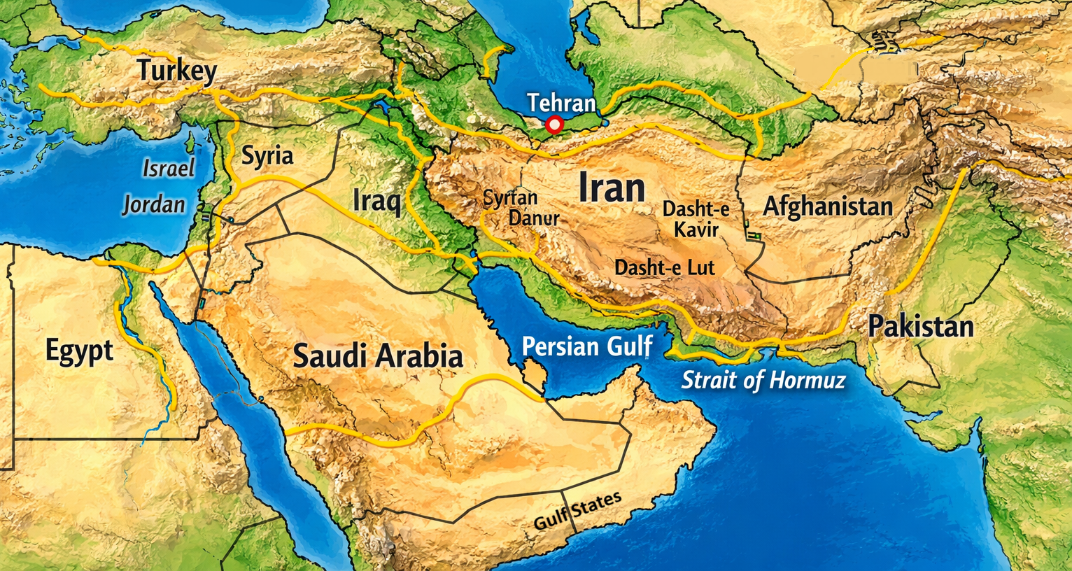
Source: Copilot AI and E. D. Hovee. Note that the yellow lines represent major population and trade corridors across the region. They trace the routes where cities historically clustered and modern infrastructure still concentrates: river valleys, coastal plains, and transit paths linking fertile zones and ports. Syrtan Danu is a mountain range in western Iran. Dasht-e Kavir and Dashht-e Lut are desert regions.
Proposals for war cessation and counters have been flowing fast and furious. As of this Memorial Day, some resolution, whether interim or more permanent, is maybe forthcoming. Maybe not.
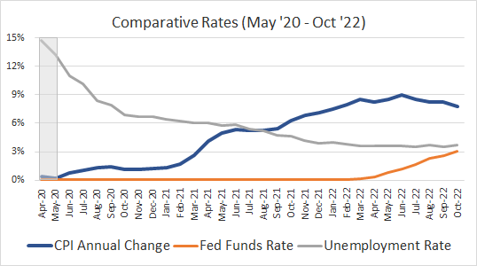
Public opinion polls make clear that a majority of Americans oppose the war both currently and prospectively. In effect, the current consensus aims for the short term benefits of quick cessation but at the likely expense of long term global instability and eventually renewed nuclear threat.
This blog post poses the counterfactual. What if the U.S. alters its seeming haphazard strategy to aim for a long-term solution sooner rather than later? A solution that may require some form of regime change together with the the longer term benefits, albeit likely offset by near term economic and military commitments.
The conclusion offered by this post is straightforward. More extensive U.S. and allied intervention may be warranted to end the current conflict and also secure lasting regime change. While economic issues of oil blockade and humanitarian issues of civilian deprivation are of importance in the here and now, these are essentially trumped by a more fundamental existential concern over the long-term inevitability of eventual nuclear holocaust and/or holding much of the civilized world as hostage via a competing strategy of Iranian retribution.
This post addresses the Iran war from both historical and present-day perspectives. notably including review of:
A century of U.S. War experience
Reaching back to other potentially similar conflicts
A case for regime change?
A 10-step approach for war cessation and regime change
Consensus for change?
A Century of U.S. war experience
Considered are examples of successful and not so successful war and associated regime changes involving the U.S. over the last century or so — extending back to World War I.
Successful Regime Change. Wars with U.S. involvement over the last 100+/- years achieved successful short-and long-term regime change in the aftermath of World War II for Germany (with provisional governance allocated between the U.S., Great Britain, France and the Soviet Union). Hand off of democratic German governance occurred 10 years after the war’s end in 1955, much later followed by collapse of Soviet governance in 1990. This managed approach to jurisdictional transition proved successful for a range of reasons including strong pre-war German institutions, relatively high national identity cohesiveness, broadly stable democratic democracy (though delayed for East Germany), and Marshall Plan funding for rebuilding.
Italy presented similar potential but with more turbulent post-war governance, due to conditions of lesser national cohesiveness and institutional capacity going into the war.
Japan returned to self-governance more quickly than Germany, with full sovereignty restored as of 1952. While Japan did not receive Marshall Plan funding, the U.S. did provide economic recovery assistance through other means.
Lesser Success for U.S. Vietnam, Iraq, and Afghanistan represent mid-to-worst case outcomes, particularly with untimely and haphazard decisions to exit Vietnam and Afghanistan and fragmented, sectarian challenges in Iraq. Opportunity for success was also slimmer due to weak and eroded pre-war institutions coupled with American abandonment prior to achieving stable and population-responsive long-term governance.
Lesser Success with Multi-National Involvement. Iran’s coup of 1953 leading to installation of the pro-western Shah occurred with British and American involvement. While the country has long-standing national identity and institutions , there is lingering anti-coup memory coupled with 1979 backlash. ousting the Shah and transitioning to a theocratic Islamic Republic. While recent U.S. bombardment has removed the Ayatollah and Shiite leadership, Iran’s experience of this past century means that current governance, though fragmented, can be expected to resist or destabilize any serious initiative for lasting regime change.
Experiences of Bosnia and Kosovo in the mid- to late 1990s involved NATO (in both instances) with further EU involvement in Bosnia and UN initiative in Kosovo. In both cases, prewar institutions resulting from the breakup of Yugoslavia were weak, further hampered by substantial internal ethnic divisions. Not surprisingly, governance today remains as what might be variously termed as semi-functional, fragile, partial and still contested.
World War I. While it has been more than a century since this “war to end all wars,” it was essentially the first war to be conducted on a global basis involving all the great powers of the time. However, parallels with the current Iran War abound.
The key parties stumbled into a war marked by strong leader personalities and sparked by the one-off incident of a Balkan assassination. Once pulled into war, it proved impossible for parties to back down, despite or because of massive bloodshed made possible by modern weaponry.
Post-war results were no more positive. Internal conflict led to revolution and creation of a communist state in Russia. Germany was dogged by massive war reparations which proved impossible to fully repay, leading to the rise of Nazism. While the U.S. proved instrumental in bringing war hostilities to an end, subsequent retreat to isolationism would prove to catch the nation off-guard at Pearl Harbor.
Reaching Back to Other potentially similar Conflicts
Going further back, there are numerous other conflicts — some with more parallels to the current Iran War than others.
Civil Wars. Of particular note are the American Civil War of the 1860s and the English Civil War of 1642-51. Unlike the Iranian conflict with a major external power in the U.S., the American and English civil wars were largely internal conflicts driven by fundamental moral issues, notably slavery in the U.S. and by conflicting religious and governance issues in Britain, exaggerated by geographic divides.
While there are no direct on-point Middle East examples, there are some similarities over the last century that involve a mix of internal and externally stimulated conflicts. In the wake of World War I, Britain created the modern state of Iraq, also the British Mandate for Palestine. Conversely, Iran (previously known as Persia) has maintained boundaries with longer term historical roots, without direct imposition by Britain and other European countries.
Religion has played a major role with Iran being predominantly Shiite Muslim. While Iraq is also predominantly Shiite Muslim, there are substantial Sunni adherents especially with governance and also regionally (as in Baghdad and areas with large Kurdish populations). In Iran’s case, religious cohesion has contributed to less tolerance for dissenting or minority views.
Revolutionary Wars. Of added note are the American Revolution against an external sovereign in England and the French Revolution in France. Both were occasioned by real and perceived resentments of the populace against their imperial overlords.
There is some parallel with Iran’s 1953 coup. Escalating tensions eventually led to 1979 the overthrow of the Shah coinciding with the Islamic Revolution. The overthrow also reflects built up resentment of the population against British and U.S. exploitation of oil resources.
Neighborly Conflict. Iran’s relationship to Iraq bears some limited similarity to internally generated civil wars and revolutionary conflict. The Iran-Iraq war of 1980-88 occurred as Iraq feared that Shiite ideology would inspire Iraq's Shiite majority against Iran’s Sunni-dominated government. Saddam Hussein invaded Iran. The eight-year conflict resulted in a devastating stalemate, causing up to a million casualties and ending in 1988 with no significant territorial gains for either side.
7 and 30 Year Wars. Finally and while historically remote, the Seven Years War (1763) and even earlier Thirty Years War (1648) offer noteworthy parallels to Iran’s current situation and future prospects. As may become the case with Iran, the Seven Years War escalated into a global conflict involving Europe, the Americas and India ending with Britain and Prussia as winners offset by France losing key colonies. All sides suffered fiscal strain that fed later revolutions.
By comparison, the Thirty Years’ War proved to be a long, brutal, mostly Central European conflict mixing religion and power politics, fought heavily through proxies and mercenaries, ending in the Peace of Westphalia—recognizing state sovereignty, legalizing religious pluralism at the state level, and creating a more rules‑based balance among powers.
The lessons learned are quite different coming out of these two conflicts. Overall, the Seven Years’ War may be considered as a template for decisive but destabilizing victory while the Thirty Years’ War is more the template for exhaustion‑driven and negotiated order going forward.
Lessons Learned
From the multiplicity of examples reviewed, it is possible to extract key lessons learned — especially from conflicts that have the greatest similarities with current and prospective conditions of the Iran war as experienced to date. Lessons learned vary depending on the conflict considered but are highlighted for four contrasting conflicts dating from the last century back to the end of the medieval period:
The World War II approach ended up performing well with clear acknowledgement of outcomes for those victorious and defeated, subsequently reflecting conditions of imposed regime change, culturally aware occupation, reconstruction and a credible path back to self-governance.
Earlier World War I experience demonstrates the risk of delayed U.S. involvement. Lessons learned are that crisis management matters more than intentions, delayed action means that war aims inevitably creep. and recovery is unworkable if found to be not feasible (for all sides).
The experience of the Seven Years War of the 18th century suggests that theater proliferation can be dangerous as no side wants to appear weak; this means that victory may be strategically ambiguous if not destabilizing both short- and long-term.
In contrast, the Thirty Years’ War of the 17th century reflects a long, brutal, mostly Central European conflict mixing religion and power politics, fought heavily through proxies and mercenaries, ending in the Peace of Westphalia—recognizing state sovereignty, legalizing religious pluralism, creating a more rules‑based balance among powers. and demonstrating the need for a political framework that lets enemies co-exist, offering regional security emerging after mutual exhaustion even without any clear victor.
A WW II type of outcome might be most beneficial to all parties, if negotiated agreement can be achieved in the near term. Conversely, if current conditions persist, a WW I type of result would seem most likely. A Seven Years War outcome reflects what might be considered as trending to a worst-case scenario. And the 30-year scenario suggests continued short-term intense pain, perhaps offset by eventual long-term gain.
A Case for Regime change?
Experience across the centuries demonstrates that regime change can work when it builds on strong preexisting institutions, a coherent national identity, clear external security guarantees, and a long, well-resourced occupation with realistic political goals. When these conditions are missing, even good intentions and cultural awareness can go awry. Put Simply:
Without regime change, any cessation of current hostilities may inevitably prove to be short-lived. With current fragmented but ideologically motivated leadership, Iran can be expected to disregard any agreements at its discretion with little interest as to impacts to its own population, let alone a global economy and population dependent on Iranian commitment to abide by international norms.
With regime change as initiated by the U.S. or global partners, there is realistic opportunity to end the current stand-off via mutually supported and agreed objectives both short- and long-term.
Bottom line, if the current situation persists, there is little chance to avoid short- and even long-term damage to U.S. and global economic, social and cultural vitality. — both now and potentially for years to come. Getting back to normalcy is not likely to occur unless predicated on and accompanied by regime change in conformance with global norms.
A 10-Step Approach for war cessation & regime change
Given the current situation, how might war cessation and regime change be accomplished? The short answer is by accelerated pressure on Iran for 100% cessation of hostilities coupled with some form of regime change. This pressure would be ramped up as needed until such time as sustaining Iranian cooperation with international norms is achieved.
In generalized chronological order, here is what reasonably could be considered:
Time-certain resumption for U.S. re-engagement of high priority military action — unless and until Iran capitulates.
Cooperative action by Iran, U.S. partners, and shipping interests to quickly and permanently re-open the Persian Gulf and Strait of Hormuz.
Resumption of destruction of key destabilizing Iranian military and nuclear assets — leading to Iranian agreement to assist in nuclear asset destruction and commit to non-proliferation.
Preparation, publication and adoption of a publicly supported strategy for Iranian war cessation — as has occurred historically with unconditional surrender of adversaries in two world wars or with negotiated surrender as with the U.S. Civil War and Revolutionary War.
Soliciting and securing international support for re-engagement with uniformly agreed protocols — as a coalition of the willing ideally including the United Nations, NATO and Middle East/Gulf nation consortium.
Active efforts to avoid and minimize U.S. military and Iranian civilian casualties — as well as avoiding destruction of pivotal civilian-related infrastructure.
Near-term facilitation and provision of humanitarian aid as needed — and as supported by Iranian guarantees for free transport and distribution.
On the ground U.S. and allied on-going military presence — pending phased return to self-governance and elimination of organized Iranian hostilities.
Implementation of Marshall Plan like reconstruction investment — likely U.S. led but with broad UN/multi-nation participation.
Phased return of Iranian self-governance — once sustained population-responsive leadership is achieved.
Consensus for Change?
The critical missing link in all of this is the absence of broad U.S. public support for current or prospective military and/or regime changing actions. Without public and congressional support, the best that can be hoped for is some, likely halting, movement on action items 1-3 — short-burst military action, Persian Gulf reopening, and positive movement toward nuclear cessation.
Unfortunately, the best result of short-term thinking is likely to be giving up on long-term gain in order to avoid further short-term pain. Political winds will shift to premature disengagement. Think Vietnam, Afghanistan, Iraq.
America and the world can achieve more, but only if the Administration is prepared and willing to prepare and lay out its full strategy — short and long-term — before the public, congressional representatives, global partners, Iranian combatants and citizenry. Anything less likely underachieves.
Note: This blog post utilizes AI generated information from Google Search and Copilot. Posting is subject to revision as war conditions change.